Highsmith uses his sketchbooks to document things he observes, ideas picked up from books and conversations, playlists of the music he listens to, anything that seems interesting to him at the moment. Across multiple pages and sketchbooks, these unrelated things combine together in unplanned ways. In that chaotic mix, he sometimes finds new ideas that can be turned into typefaces, like Occupant Oldstyle.
Occupant Oldstyle is a 21st century text face. Highsmith drew it with assistance from Occupant alum, June Shin. The rounded triangular endings are the result of a long fermentation process that combines ingredients from Japanese Mincho style typefaces, rounded sans serifs, electronic music, and toys. Highsmith calls them ‘child-safe serifs’.
Below, he explains more below about Occupant Oldstyle in his own words.
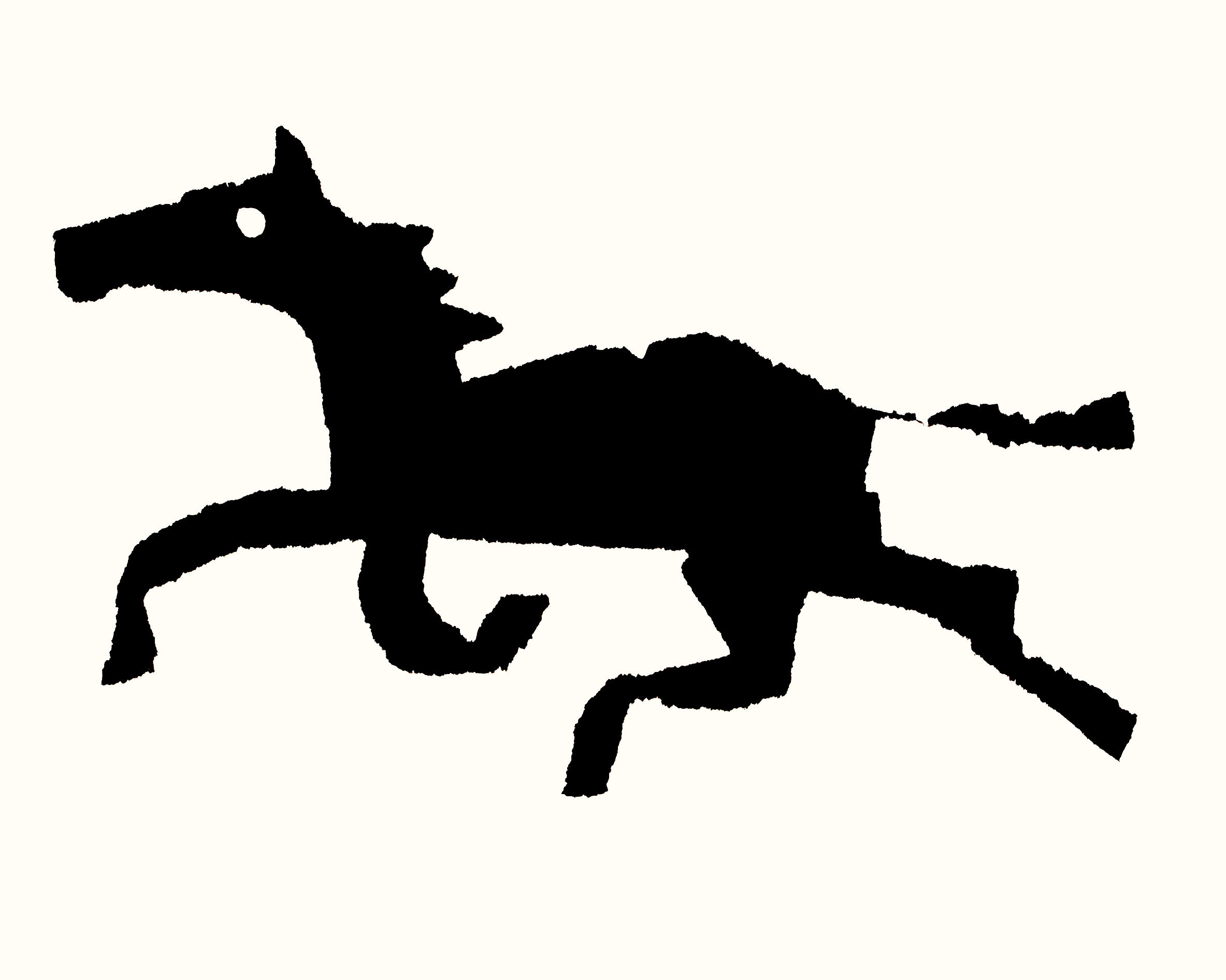
“I like the simplified forms used in toys, especially ones for very small children. For example, the design of a toy horse might be reduced to the minimum of basic elements needed to make it recognizable as a horse. I’m drawn to graphic artists who think in a similar way, who flatten and reduce complex objects into simple shapes.
Type designers also work with simplified, flattened shapes. Calligraphic letters are reduced to more mechanical and basic versions of themselves. Some of the life and subtlety is lost but it’s made up for by the ability to make convincing unplanned patterns and combinations.”
Don’t be fooled though—he has no idea how they work.
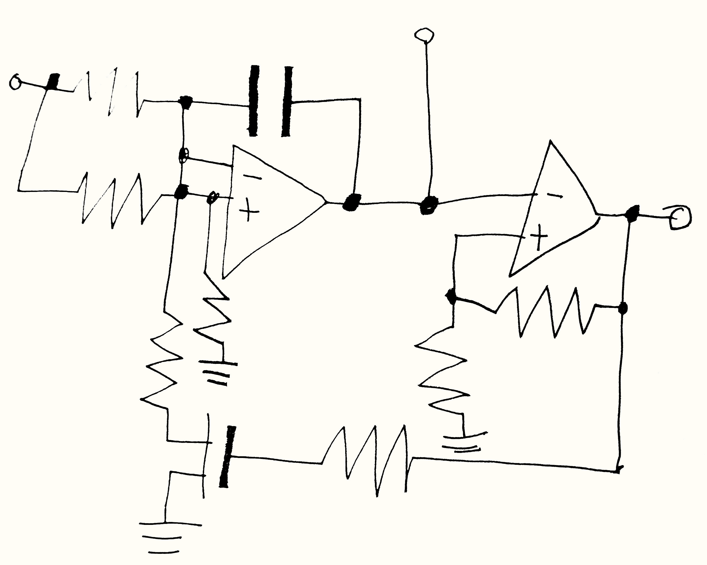
“During the pandemic, I took refuge in listening and making music. I’m drawn to electronic music because it often explores mechanical rhythms in a way the resonates with me as a type designer. Even more important, synthesizers invite experimentation and play. Using them helps me more easily get into that mindset when I’m drawing letters and making typefaces.”
It’s an exercise in investigation not accuracy.
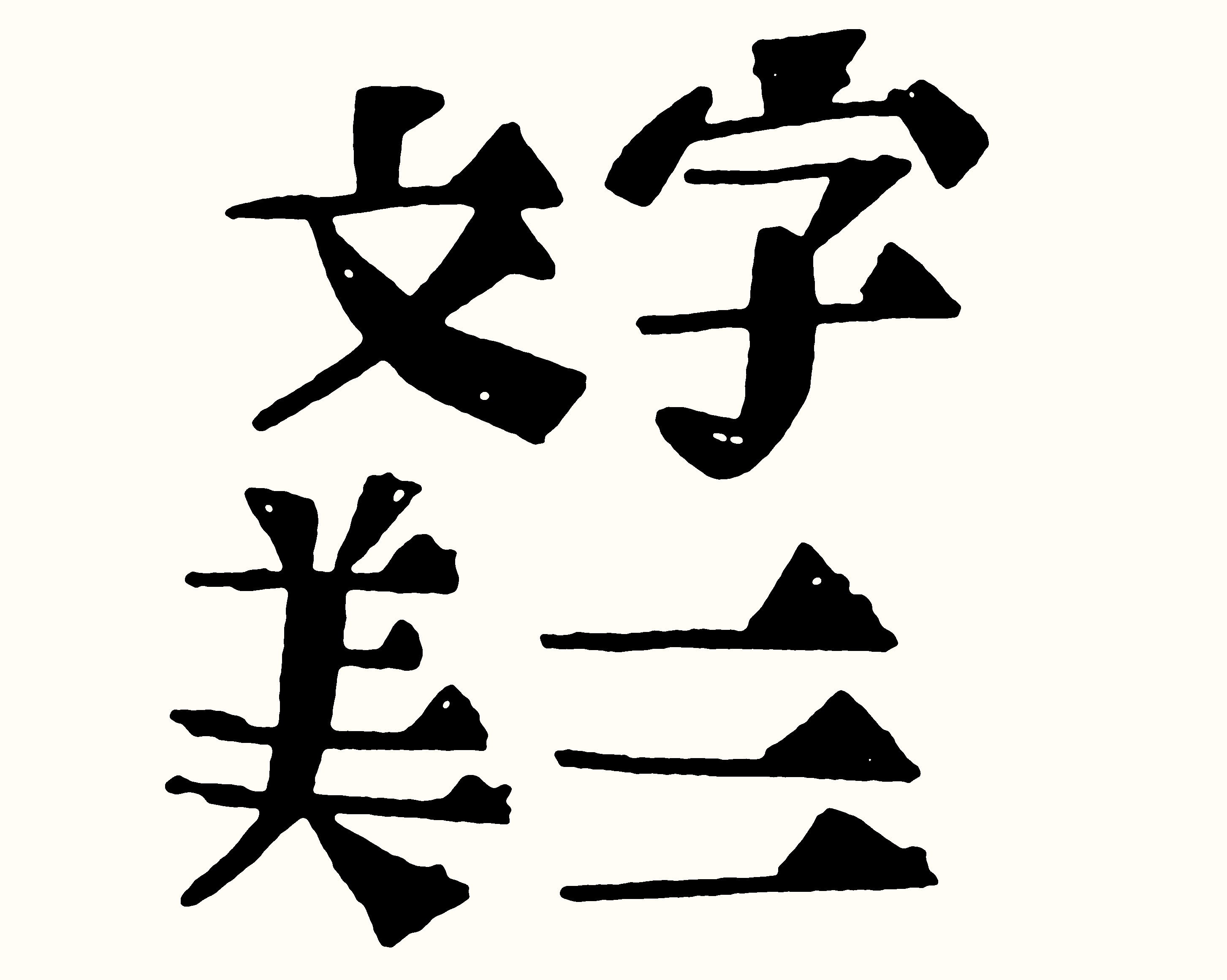
“Part of my job at Occupant Fonts is to design new latin typefaces with Morisawa’s Japanese library in mind. This time, I drew on a whole category of typefaces known as Mincho rather than a specific typeface. Mincho typefaces are often used for text in books and newspapers. The characteristic triangular endings of the horizontal strokes in Mincho lead me to experiment with new serif shapes. While I’m careful not to appropriate, I find that studying Japanese typefaces offers ways to reexamine the latin type conventions I’m very familiar with.”
To see Occupant Oldstyle in action, visit this minisite. Like all Occupant Fonts releases, Occupant Oldstyle is available for print, web, applications, and ePub licensing on Type Network. Webfonts may be tested free for thirty days.