Poetry in motion
The unusual forms of Pentameter began as a poster commission for the Poetry in Motion initiative, a public arts program that places poetry in various modes of transportation across cities. Whether on the RIPTA bus or the MTA subway, I’ve always loved seeing a poem where I might normally see an advertisement. It’s a momentary reprieve from the hectic scramble to get to places, a captivating rest beat. I was delighted when Tina Cane of the Providence chapter contacted me to design the poster for the poem “But Beautiful”, by Sean Singer.
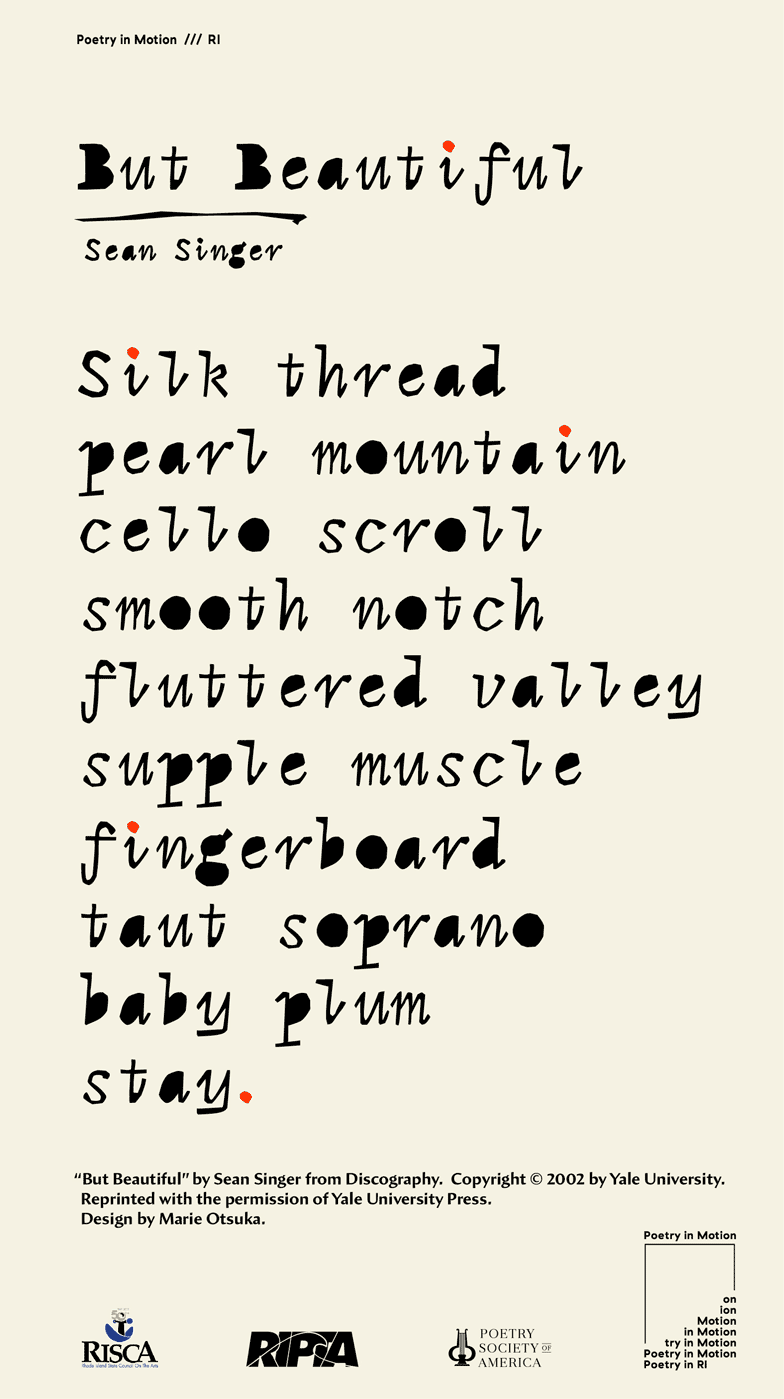
I was drawn to how the poem vibrates with a concise rhythm and tactile tones—I wanted to create letters that have a similar improvisational texture but are still punctuated by a beat, like a jazzy interlude. To leave room for some spontaneity, I first cut out small letterforms with an x-acto knife to make rough sketches. The lack of control with the friction from the blade and paper helped produce unexpectedly tangible forms. (I learned this technique from Cyrus, who often uses this technique in his screen printing.) I then started digitizing them into fixed-width glyphs.
If “But Beautiful” was my poetic/musical inspiration for Pentameter, a sample of “Aldine cursive” I discovered in the book W.A. Dwiggins: A Life in Design was my visual one.
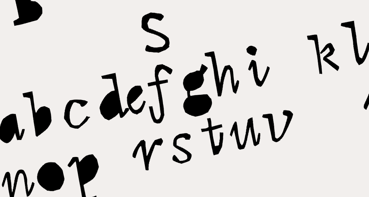
Here, Dwiggin’s correspondence describes the design as “aimed at social letters—home use…”. I enjoyed the idea of a monospace for “home use,” for letters to friends and family—rather than for “business,” serious coding, efficiency, or establishing legitimacy. Along those lines, Toshi Omagari’s Dossier is a friendly interpretation of Dwiggin’s sketches, with a “soft and casual personality.” I hoped Pentameter might similarly carry the care and quirkiness of a personal letter, but also reveal its digitally-native construction, staying true to a monolinear, vectorized typographic structure. Stroke edges are sharp, rather than mimicking the softness of ink on paper, and the skeletal frame remains stiff. There is an interesting parallel between vector-drawing and x-acto-cutting: it’s a lot easier to control straight lines than curves. So instead of treating this as a revival, I sought to balance rigid, vector materiality with Aldine’s expressive warmth, bending the scaffolding of a low-contrast slab with the flare of the “cursive” genre.
In serifs, the italic traditionally features properties closer to calligraphic forms, with script-like tails that glide your eyes across the baseline. With its proximity to handwriting, there is an intimacy inherent in italic forms. So I decided to draw the roman as an “upright italic,” with amplified tail endings. The roman letters are more square than the italic and lack a forward momentum, but they still bounce with the same exaggerated out-strokes. This inflects a syncopated cadence into the monotony of monospace glyphs, and imbues them with a lively rhythm.
азбука
A function of time
Pentameter can express this intimacy of italics not only in poetry, but also in prose and code. As a designer and instructor often working with code for creative purposes, I wanted to produce a tool for hand-made programming. When teaching web-related classes, we might begin by questioning the need to code by hand: there are already a myriad of tools available that can generate a website with a click. Much of the code out there today is not composed by humans, but by systems and algorithms. Moreover, the process of writing code by hand is unforgiving: one typo breaks everything, and learning it is often a frustrating repetition of trial and error.
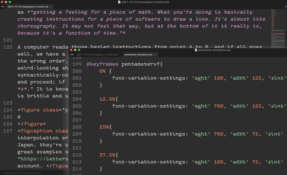
As an extension of writing code in general, there is also an inherent friction in the process of drawing fonts with vectors. While handwriting follows the hand, beziers connect points within a device-determined resolution. Instead of strokes, we draw mathematical shapes. Artist Jürg Lehni once described vector-drawing as “getting a feeling for a piece of math. What you’re doing is basically creating instructions for a piece of software to draw a line. It’s almost like choreography. It may not feel that way, but at the bottom of it it really is, because it’s a function of time.”
A computer reads those bezier instructions from point A to B, and if all goes well, we have a line; if our instructions are written incorrectly or placed in the wrong order, the line trips over its toes, and we have a weird-looking shape that has collapsed in on itself. Similarly, if we have a syntactically-correct line of JavaScript, it is able to execute the command and proceed; if not, it shuts down and presents an “error at line x.” It is because of this exacting temporality of computers and its encoded logic of order that technology is so uncompromising.
Despite all of this, we still plot beziers with a mouse to create a font; we still write code in a text editor to create a website. One reason is that this method provides a deeper understanding of how these digital objects work—and how we might reinvent them. Generative systems are embedded with assumptions about how a site should look or behave; sometimes these assumptions align well with what we need, but many times, they do not. By engaging directly with code, we can create software rooted in our own values and visions. Furthermore, this makes room for surprising encounters in the errors made along the way. Like the friction from the x-acto knife, working with a challenging material can be an opportunity to discover unexpected forms. We can work with code as an empowering and experimental creative medium.
From J. R. Carpenter’s essay A Handmade Web to projects like Laurel Schwulst’s html.energy, many have humanized our relationship to technology by embracing the joy and limitations of hand-writing code. Handcoding can be an act of resistance against the pressures of productivity and efficiency powering capitalism. It provides us the capacity to choreograph imaginative interactions and inventions. Most importantly, making becomes more about the process rather than the outcome: we can enjoy the act of handcoding itself. All we need to do is just stick to the beat–remember the unwavering rule of time.
“Responsive” design
Pentameter reflects the tension between the hand and digital mechanics, exaggerating the contrast between straight lines and curves, abruptly bending to conform to fixed widths. And while highlighting the rigidity of its containing technology, it also takes advantage of the freedom afforded by drawing with math: an infinitely fluid design space. Although all glyphs are tuned to the same “pitch” to stay a true monospace, this width is configurable by the designer, ranging from condensed to wide. Moreover, the slant axis—usually a binary choice—is a continuous dial of speeds for the type to move across the page. With the increasing popularity of variable fonts since 2016, not only are typefaces constructed as a function of time, but their expression also relies on coordinated time signatures—letters shape-shift across their design space in animations.
We often talk about “responsive design” to discuss how web layouts and typography can adapt to different devices, and the flexibility of variable fonts is well-suited for fluidly adapting designs. But this kind of responsivity is not a new development. From the era of metal type, typefaces have always been designed to accommodate for various optical sizes and material conditions, from the micro to the display cuts. What is new is the capacity for us to access any point in between a given design space. On the web, variable fonts can smoothly animate “responding” to any kind of input: whether those are interactions with the website visitor, browsers, or wind, sound, glacier data… the possibilities are endless.
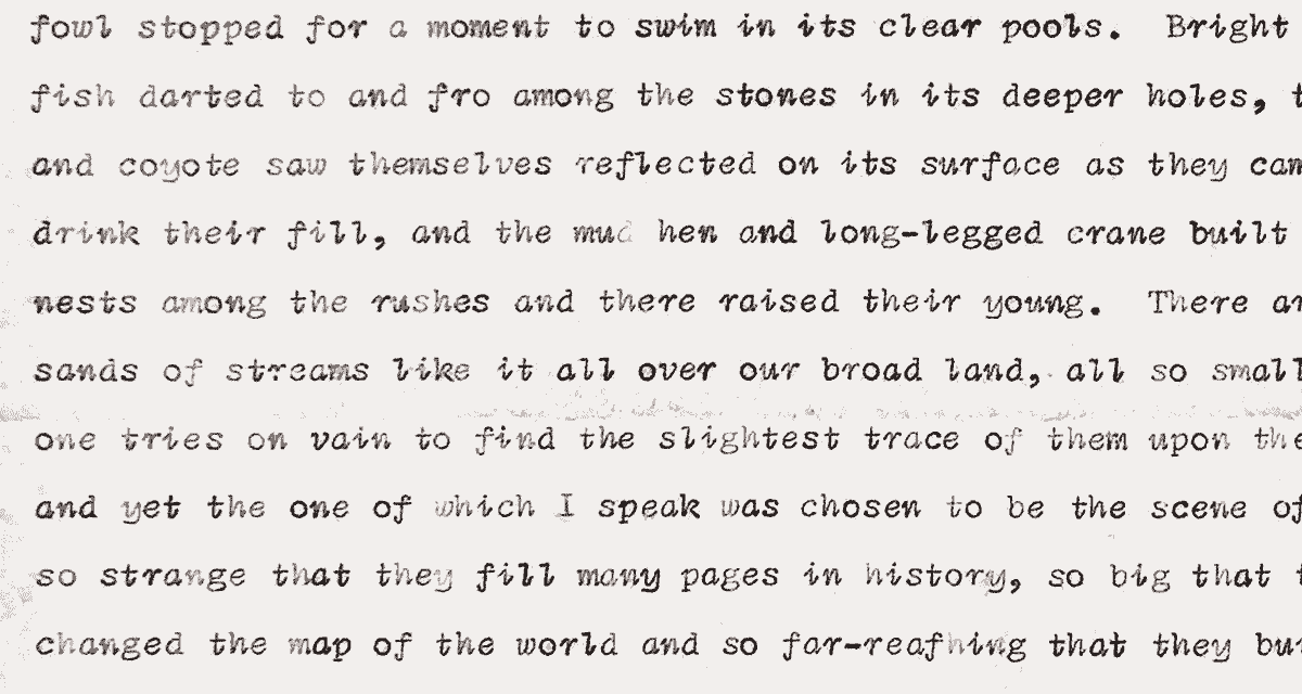
In order to test the fluidity of Pentameter during the design process, I created a website that allows direct access to all points in the variable axes. Considering the typeface’s roots in poetry, it felt appropriate to set poems during the proofing process, and I used an API to pull random poems for varying textures. Another benefit of this tool was being able to see the typeface with various diacritics and glyphs I’m unfamiliar with, because the database contained poems in different languages.
Pentameter also contains stylistic features unique to typographic needs on the web. One of the foundational functions of the internet is the “hyperlink,” conventionally denoted with an underline. However, the ways browsers render those lines (technically, text-decoration: underline) have always been inconsistent. Pentameter celebrates the hyperlink with built-in underlining as a stylistic feature—a line that “links” the letters together. The underline has historically been known as the viniculum (source), which means “unifying bond” (Merriam Webster.) As a fundamental feature of the world wide web, the underline’s etymology—and the need for an internet that binds and unifies rather than divides—feels increasingly significant today.
normal linking
Please note that this is an experimental feature breaking several standards of Open Type features, and may not work in all conditions, including tracked-out text. Safari currently does not support substituting spaces, and the line will break on multi-word phrases. Please feel free to get in touch with any particular needs or ideas around this! (This feature is also not intended for desktop and is unsupported in InDesign, but customized underlining is already a built-in feature of the software.)
Poetic computation
Taeyoon Choi describes “poetic computation” as a consideration of “code as a form of poetry and aesthetic.” While the School for Poetic Computation that Choi co-founded is currently reevaluating its model to better align with their values, their original mission to foster a community of care through alternative engagements with technology still resonates. I believe that with type design as well, the choreography of points, and how they move and transform, can be a poetic medium in and of itself.
In an attempt to bridge the hand and the machine, Pentameter is a provocation for tender tools in the digital realm. Despite being mechanically angular, it originates from a spirit of intimate improvisation. The resulting typeface, clunky yet fluid, is an awkward dance of serifs with script endings with an offbeat rhythm—but hopefully, one you can enjoy moving to.
Check out the Pentameter type specimen at Seasons in Pentameter, created in collaboration with Laurel Schwulst and Tiger Dingsun. Like all Occupant Fonts releases, Pentameter is available for print, web, applications, and ePub licensing on Type Network. You can contact Type Network for specific access to the variable font as well. Webfonts may be tested free for thirty days, and you can download a desktop trial right from this website.