
Mantar is the result of a series of experiments driven by curiosity and reflection. In 2018, I taught an undergraduate course at the Rhode Island School of Design and was simultaneously working on a lecture-essay titled Politics of Style. My goal was to understand how style in graphic design might have been used as political soft power to colonize and dominate cultures and how we, as graphic designers, could be more articulate in decoding stylistic subtleties in order to mindfully subvert the use of styles as a tool for disruption. Throughout the years, I observed some of the students masterfully executing these stylistic subtleties. They sometimes failed to see the potential of their craft or failed to realize its danger of misuse.
That year, the students were bringing in works about extreme consumerism, capitalism, mass culture, authority, and surveillance. Of course, being situated inside a Graphic Design context, these themes were communicated mainly through manipulating typography, colors, textures, and form. I came by many works mirroring the harshness and the aggression embedded in some of these topics. It was particularly alarming to observe such visual treatments transform into a visual fetish or fashion. This was mainly thanks to the influence of social media and the hyper-circulation of these images on the web. Without realizing it, I was becoming sensitive towards eye-piercing typefaces with long and pointy endings or headlines set in high contrast De Vinne-like Roman capitals skinned with faux metallic textures and presented alongside hyperreal materials rendered in 3D software.
Phototypesetting
In late Spring of 2018, during a casual visit to the Providence Public Library, I came across a phototypesetting promotion booklet titled Ultra Bold Tyght Types, published by Photo-Lettering Incorporated in 1972. The book was one of the many artifacts pulled out that day by Jordan Goffin for a class visit. This catalog was a collection of large, tightly set phrases in various bold and loud typefaces. Inside this catalog, the plates prepared with white typography on black backgrounds especially pulled my attention. The work looked deceivingly contemporary (some due to the tropes I touched upon above). However, it lacked the brutal precision and the contrast—a side effect of the current digital reproduction methods. Due to the limitations of the photographic printing process—and probably the age of the booklet—the blacks were heavily yellowish and warm, and the type was off-white. As I spent more time with the booklet, I began to notice the slightly out-of-focus letters that were blurred on the edges. This blurring was even more prominent on small catalog numbers printed on the right bottom corner of each composition. The smaller the type got, the fewer corners and straight segments it was left with. As a result, the type looked a lot softer. This mechanical warmth of the otherwise aggressive and loud type was a refreshing afternoon encounter.
A Warm Scotch
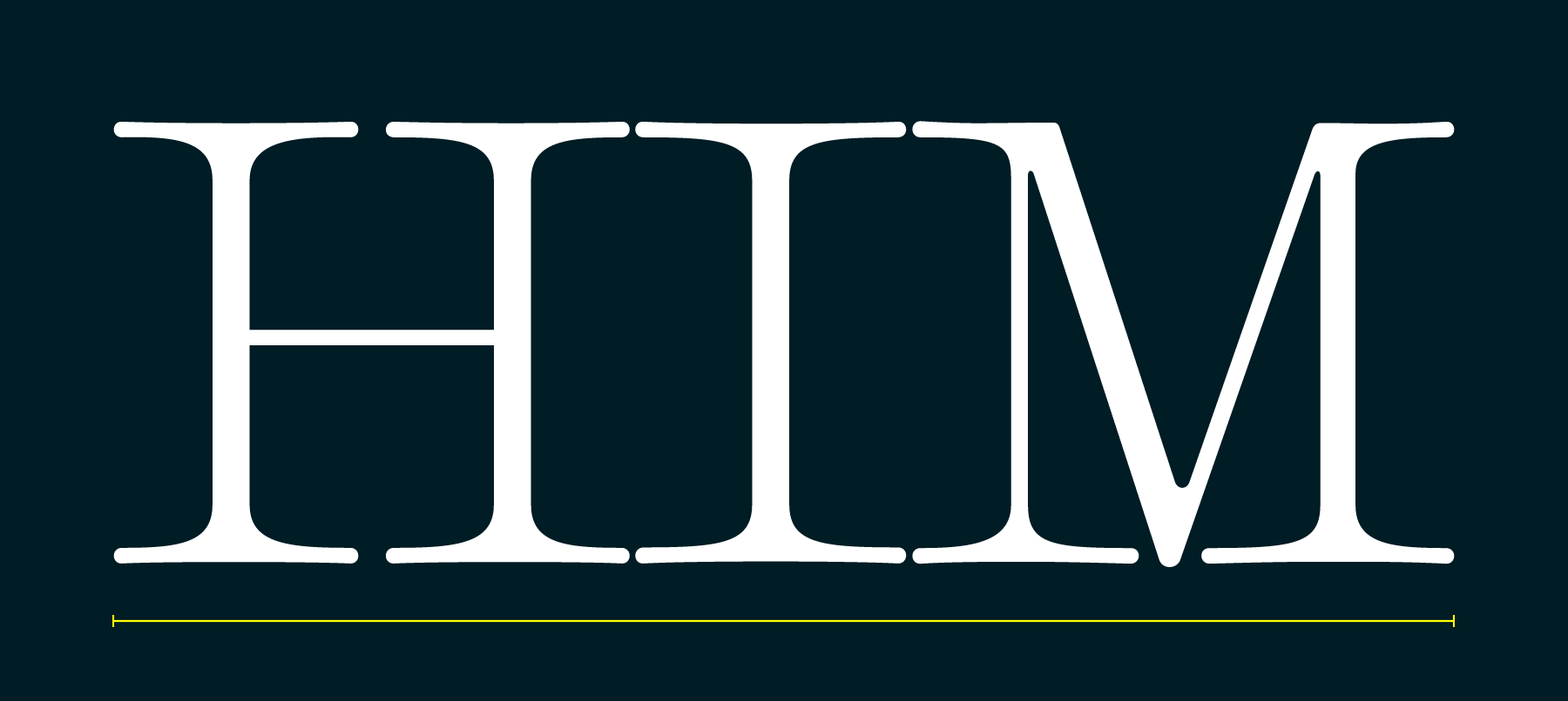
What are some ways to synthesize the exact, sharp, and mathematical essence of the vector format with the less precise, organic, and chemical nature of the phototypesetting process? This question was an interesting one to sketch out on letters with long vertical serifs like E, F, L, or T. These glyphs can express aggression and sharpness via long and pointy wedge serifs, and they are particularly easy and quick to prototype due to lack of curves.

For this design, I relied on the Scotch Roman genre and wanted to see how some of my early rules would play out in the rest of the alphabet. One decision I made early on was to draw Mantar for a 24-point target size. This can be an awkward size that is not quite suitable for text but is not as sharp as the large display types we are accustomed to seeing. This was a choice aimed towards achieving a less smooth, clunkier display typeface. I always imagined Mantar being used in larger sizes from the get go, but I avoided the “razor edge” look despite ubiquitous, ultra-high-res retina displays.

During the development of the initial masters, I studied the staple classics of the Scotch Roman genre in addition to Matthew Carter’s Miller, which is relatively contemporary. I quickly fell in love with the signature diamond-shaped rounds of this style. Executing this trait in Mantar presented some technical challenges. It turns out, having diamond rounds along with extra-long serifs requires some tricky spacing to be optically correct. I ended up kerning the rounds away from each other (although you could also kern the rounds in towards the straights). This was a particularly amusing experiment, and it took a couple of rounds of iterating to get it to work correctly across the initial masters. Throughout the development of the design, I was able to eliminate the positive kerns on the lighter masters through adjusting the serif lengths.


Feedback Loop
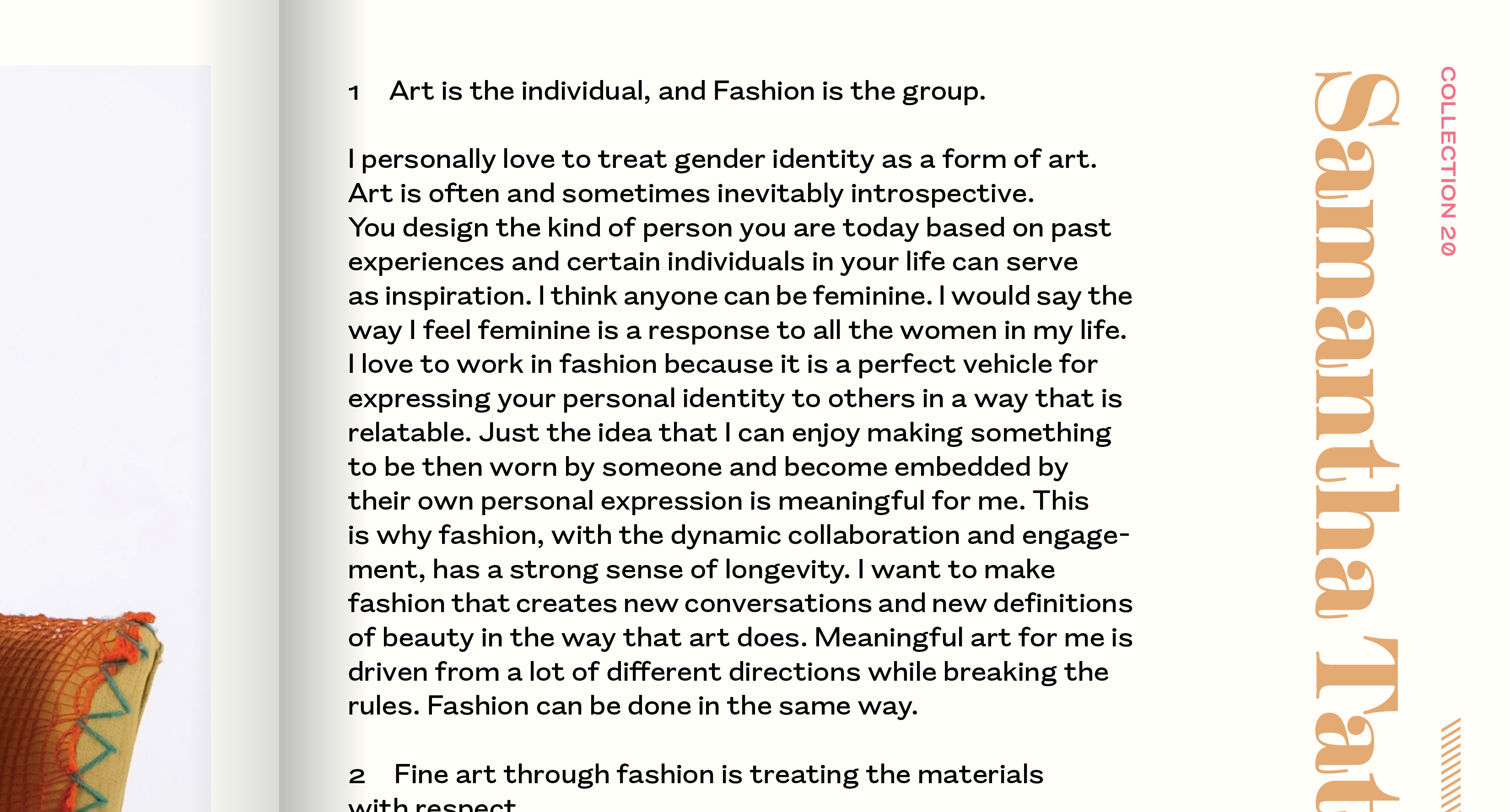
I gained insight into the family by using a beta version for design projects. Although Mantar was far from done, a couple of weights and basic characters were in good enough shape to be put to use. In early 2020, I was commissioned to design the identity for the RISD Apparel Design Department Runway Show titled Collection 20. Due to COVID-19, we had to switch plans to publish a catalog of the works rather than holding a live event. For the design of the catalog, I paired June Shin’s Rapport with Mantar Black. Both designs are warmer alternates in their own genres.
Mantar creates an interesting effect when it’s set in all caps, especially in lighter weights. It looks generously spaced while embodying the tension of a tight-but-not-touching typeface due to its extra-long serifs. In that context, the semi-old style numbers looked out of place, since they are always shorter than the cap-height. They do not fill the vertical space as well as the letters do. Without using the typeface in these projects, I wouldn’t have arrived at the decision of adding optional lining figures accessible through OpenType. I also included case sensitive punctuation and sorts to prepare the design for all-caps situations.

Originally, Mantar only had 3 weights spanning from Regular to Black and corresponding italics. In using Mantar for my various projects, I felt limited by the size of the design space, especially on the bolder side. I brought this issue to the team, and after some discussion and initial sketching, we decided to add a complimentary Ultra version to the family. Scotch Roman Typefaces do not generally get this bold. But I really enjoyed pushing the design to its limits and inventing new solutions for the new addition. For example, I exaggerated characters like f, j, and the i: the ball terminal and the tittles sink into the stems in order to keep the compact fit. The Ultra quickly became a playground for me to explore expressive forms, especially on crowded characters with larger ball terminals. Some fun characters were numbers like the 2s and the 7s; some symbols including the ampersand and the arrows; the italic z!


Notes on Italic
Following the concept of elongated serifs, my initial direction for the italics was to draw an almost-connecting, script-like design. During the many iterations, the gap between the enter and exit strokes increased. We simply realized that having these almost touching strokes created too much drama in between the letters, potentially drawing unwanted attention to themselves. That being said, considering where the final version ended up, the italics still carry the original DNA of this idea. Unlike varying serif lengths in the roman version, these enter and exit stroke lengths stay consistent across weights.

The non-kerning fs and js are brought back to life on the italics utilizing contextual alternates. Three additional variations of the f and one extra variation of the j both help avoid clashes and keep the compact fit in consecutive ascending or descending characters.

Psychedelia
Cyrus told me an anecdote about how Matthew Carter once compared designing heavy weights to drawing caricatures of the regular versions (more on this here). Caricatures by definition are representations with exaggerated features. This analogy gave me permission to dial up the defining themes in the design. On the bolder weights, the oversized ball terminals and punctuation got even louder. The mono-line stems spiraling into and wrapping around fat, organic, round shapes became more accentuated. The more I spent time with these exaggerated features, the more I found Art Nouveau-like formal qualities in some of the glyphs: dramatic and plant-like shapes and a good amount of curls.
West Coast graphic designers from the ’60s also pulled similar visual cues from the Art Nouveau movement. They created what we classify today as Psychedelia or Psychedelic design. This movement was not only about reflecting altered states of mind but in fact an ideological counterculture against the post-World-War-II materialism in the United States. In this light, some of the issues that triggered the design of Mantar back in 2018 are clearly parallel to what the psychedelic designers were thinking about. Uncovering these ideological and formal parallels between Mantar and the Psychedelic Design movement was a wonderful awakening.

Reflection
From the above notes, you might have gathered that my process of drawing Mantar was non-linear, unplanned, and deliberately messy. This approach allowed me to be responsive and reactive to the forms I was creating. The tight drawing feedback loop had been generative and forgiving. It is always important for me to remember to ask the design what it wants to be, and not get caught up on what I want it to be; Mantar was not invented, it was waiting to be found.
If you want to go on a trip, please visit the Mantar mini-site designed in-house by Nic Schumann and Cem Eskinazi. Like all Occupant Fonts releases, Mantar is available for print, web, applications, and ePub licensing on Type Network. Webfonts may be tested free for thirty days, and you can download a desktop trial right from this website.