lettering
In 2016–2017, I worked on the designs of several exhibitions and some public programs at RISD museum. One of my last projects there was the exhibition Altered States: Etching in Late 19th-Century Paris. The phrase “Altered States” immediately got me excited for its typographic possibilities. At the encouragement of Derek Schusterbauer, my boss at the time, I created a custom lettering for the title wall.
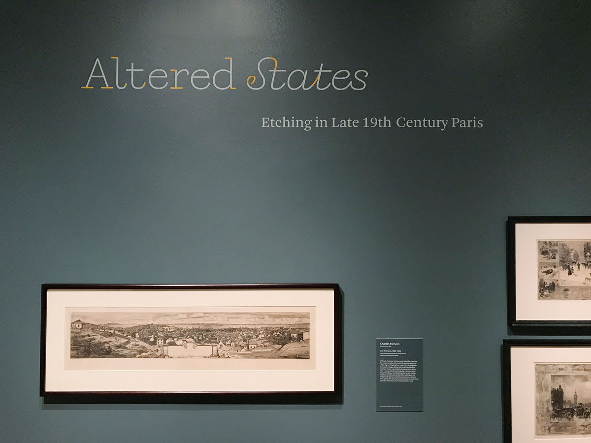
My concept for the lettering was simple: Just like the works in the show, it would also have multiple states. The title of the show, Altered States, is a nod to a technique unique to printmaking, where artists make changes between prints to generate variations, also known as “states,” from the same—but now different—plate. This idea of infinite variations has been a fascination of mine for some time, and I have pondered the ways in which it relates to type design. As type designers, we create countless expressions of the limited sets of letters that make our alphabets. Each typeface can be considered a state of the alphabet. Each style in a typeface family may be interpreted as one manifestation of many possible states that carry the essence of the typeface.
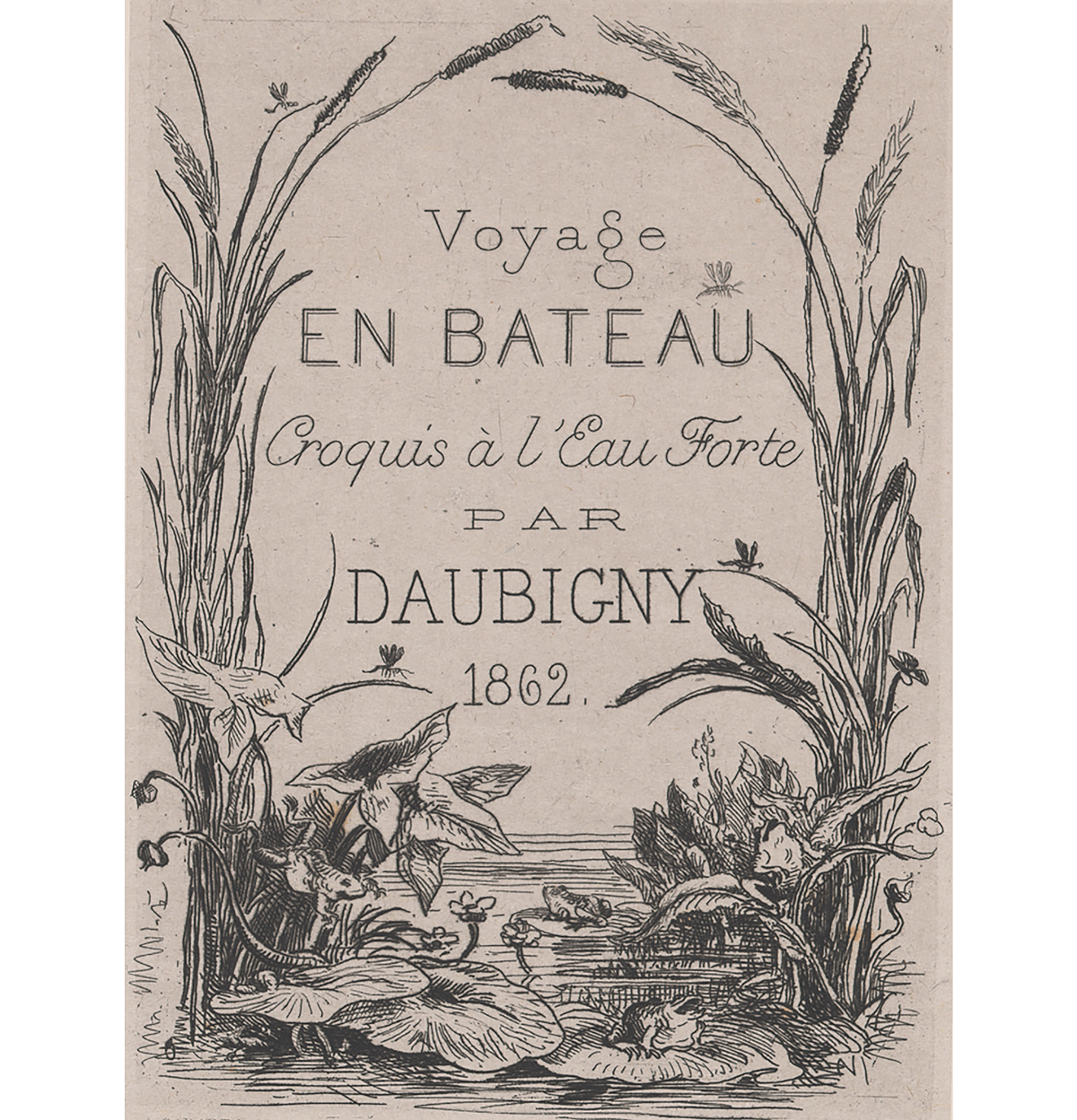
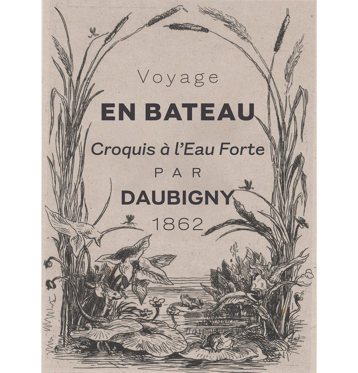
For inspiration, I looked to one of the works in the show: French artist Charles-François Daubigny’s frontispiece for Voyage en Bateau, a series of his etchings published in 1862. Centered on the page, the original 6-line lettering features serif, sans serif, and script styles, which became the different “states” in my lettering for the exhibition. For the first part of the title, Altered, I drew a serif version and cut the serifs and terminals to reveal a sans serif. The second part, States, is a script with detachable links and terminals. Ultimately, the lettering had 4 different states: serif, sans serif, connecting script, and unconnecting script.
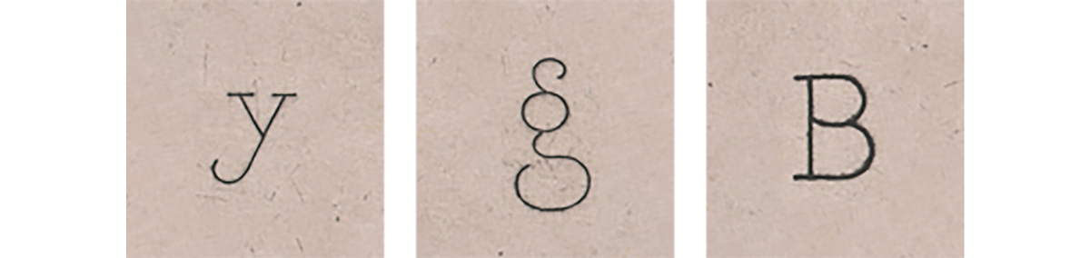
As for the design of the lettering, Daubigny’s frontispiece gave me some initial ideas about how the lettering might look and feel. You can see the evidence of the hand and its whimsy, especially in such features as the almost goofy tail of the “y,” the pompous peacock-like double-storey “g,” and the facetious top bowl of the “B” that looks like a belly hanging out over another belly. I found all of these quirky traits humorous and charming.

Some characteristics stood out more than others. In particular, I adopted the high-waisted-ness of the “A” crossbar, the underbite of the “e,” the long curly tail of the “l,” and the way the bottom ending of the script “s” is ligated to the letter preceding it. I kept the weight fairly thin, echoing the fine lines typical of etchings made with burins, but sturdy enough to withstand vinyl cutting and application.
typeface


When I began to develop this lettering into a typeface, I stayed in the exploration phase for a while, as I was jumping around the serif, sans serif, and script styles, working on all of them at the same time. This exploration turned out to be helpful in figuring out the perimeter of the design space—what type designers call family planning. Because I was working on the three styles simultaneously, I was able to determine how heavy the sans serif’s boldest style would be based on how heavy the serif’s boldest style could be before the serifs started to clog up and compromise the design. So while I could have drawn a heavier Black, I decided against it, keeping in mind that I may create a serif counterpart in the future. For now, I’ve put the beginnings of the serif and script designs in my bottom drawer.


In trying to make a more versatile and useful typeface, I modified some of the more extreme characteristics. Namely, I brought down the waistline of the “A,” lengthened the middle arm of the “E,” toned down the perkiness of the tails on certain characters, and drew a less hysterical “g.”


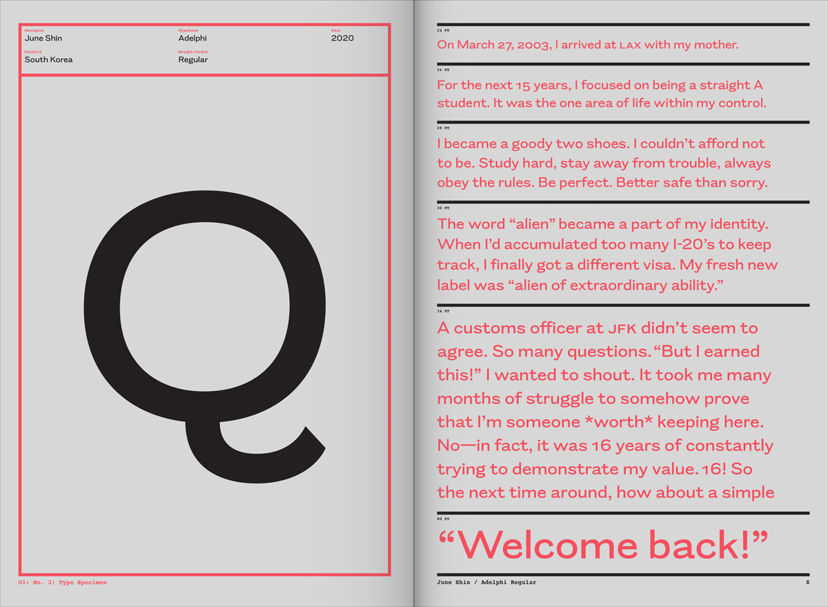
I only had a handful of letters from which to infer the rest of the character set, but they did give me some helpful suggestions compatible with the flavor I was trying to keep and enhance. For instance, the tail of the “Q” is a nod to all the wildly curly endings Daubigny indulged in. The overall naiveté of his hand lettering told me that this group of letters was unafraid to be a little awkward, and that led to terminals whose cuts aren’t perfectly perpendicular to the direction of the stroke. The most important thing for me was to preserve the warmth present in the original lettering, and so “does it feel friendly but not saccharine?” became the question I’d ask myself at every step.
In grad school, Doug Scott used to tell us to have conversations in our heads with the designers—dead or alive—whose work we admired, to figure out what they would or wouldn’t do. I did a little bit of that, but since I didn’t set out to make a revival typeface, I didn’t consult Daubigny very much. I think of it like this: I took a lime—that is Daubigny’s zesty lettering—and deciding it’s too citrusy for my taste, I sliced up, squeezed, and mixed it with a bunch of other ingredients to make my own key lime pie that is Rapport. His handiwork was always supposed to be just a starting point for something new. In the end, we still established good rapport.
Like all Occupant Fonts releases, Rapport is available for print, web, applications, and ePub licensing on Type Network. Webfonts may be tested free for thirty days, and you can download a desktop trial right from this website.