Magmatic is an exploration in width. The assignment was to see how far a design could expand and contract without changing its essential style. The results are thanks to some unconventional engineering by Cyrus Highsmith plus a lot of help from fellow Occupant, June Shin.

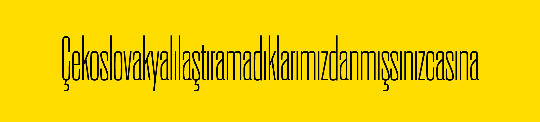
As a typeface gets narrower, the white space gets squeezed out so all the letters can pack together as tightly as possible. As part of this transformation, the rounds often become flatter and squarish. This helps to form the dense eye-catching words that make condensed designs so popular.
Unfortunately, the bezier curves used to draw typefaces can only get so flat before they distort. This means the type designer is often forced to make a choice. They can change the nature of the curves in just the condensed versions, separating them from the rest of the family. Or they can simply limit how narrow the design is allowed to get.

In Magmatic, Highsmith figured out a third way. He reinforced its curves with additional non-orthogonal points. These extra points gave Highsmith and Shin the control they wanted. They used it to push the design to the extremes of width, as well as weight, while keeping the overall feel of the series steady.
Shin was in charge of expanding the basic collection of letters and numbers into a pan-European character set including Greek and Cyrillic. She also took the monumental task of kerning. It was some serious heavy lifting.
At the moment, Occupant Fonts is releasing Magmatic as a standard OpenType font in 30 weights and widths. Soon, we will also publish it as a variable font. The variable font format is where Magmatic’s abilities will really sing. We are already using a beta version on this website. You can see it in action on the top main menu and see how it responds to different browser widths. Anyone who licenses the complete family can receive a free upgrade to the variable font version as soon as it’s ready.

Like all Occupant Fonts releases, Magmatic is available for print, web, applications, and ePub licensing on Type Network. Webfonts may be tested free for thirty days.