I first became aware of Morisawa in the 1990s, back when I was still a student. I heard about the company through its prestigious type design competition—not that I thought I was good enough to enter. This was a competition for real type designers. In those days, I was trying to make typefaces from pieces of construction fencing and deconstructed stencils. Still, the competition intrigued me; I was curious to know why a Japanese font company would be interested in Latin type.
Not much later, despite my unorthodox approach to letter drawing (or maybe partly because of it), I got a job as a type designer at Font Bureau. That job lasted almost twenty years. At Font Bureau, I was trained by Tobias Frere-Jones, David Berlow, and Matthew Carter. Between them and my coworkers, I couldn’t have asked for better teachers. And Sam Berlow was always on hand to coach me along. During that time, I drew many of the typefaces that would eventually become the Occupant Fonts library.
I regret that I never got around to entering any of those fonts into the Morisawa Type Design Competition. Thanks to Matthew Carter, however, in 2012, I found myself in Osaka, serving on the competition’s Latin jury. Matthew was there, too, along with Sara Soskolne and Akira Kobayashi. Plus, I got to meet Japanese type design legends Masahiko Kozuka and Osamu Torinoumi. No less than Fred Smeijers joined us at later competitions, starting in 2014.

That was my first formal introduction to Morisawa. Since then, we’ve collaborated on various projects. These have included workshops in Japan, presentations, licensing agreements, and an extended stay in Akashi to work with Morisawa designers on adapting one of my typefaces to work with Japanese. In addition, Morisawa has been a supporter of the children’s book series that I developed with Hiroko Sakomura, published by Bunkeidou.
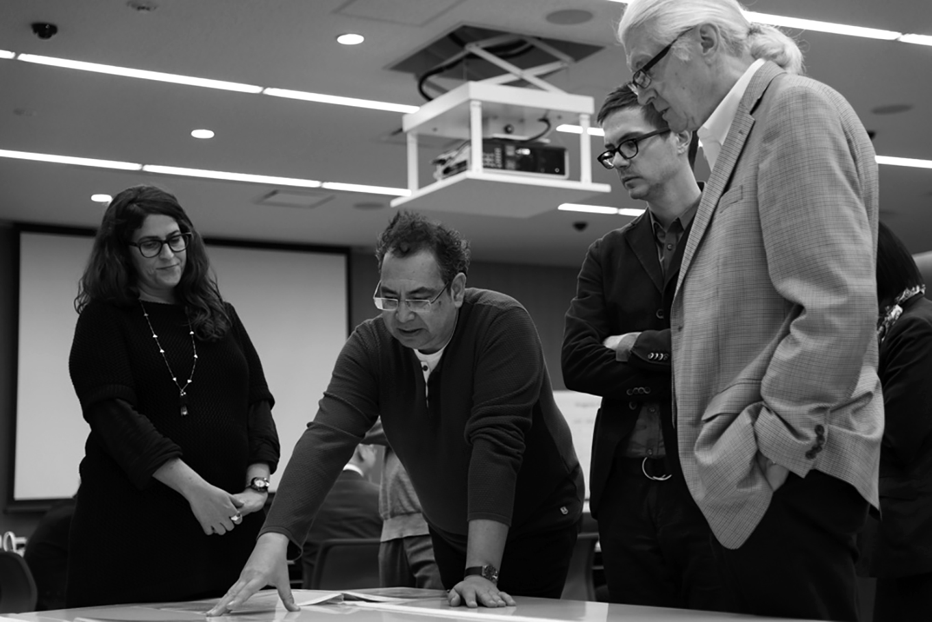
In 2017, Morisawa acquired Occupant Fonts and hired me to keep running it. In addition, I have been joined by type designers, Cem Eskinazi, June Shin, and Marie Otsuka. We work from The Design Office, located in downtown Providence. It’s close to Rhode Island School of Design, from which Cem, June, and Marie recently graduated. They’re the latest in a long line of type designers coming from RISD.
At Occupant Fonts, we will continue to focus on the development of new Latin typefaces while we look for ways to connect our work to Morisawa’s Japanese type library. The potential for collaboration and learning are two big reasons I took this job. I’m hoping it will push my work in new directions. The interest Morisawa showed for original Latin type design, which I first observed back when I was a student thanks to the competition, persists today.
Here’s to the future!
Read the press relase Morisawa Opens Latin Type Designing Office in U.S. on Morisawa website. View Cyrus Highsmith’s ATypI 2017 presentation Pulling out of the concept “subordinate Latin” on YouTube.