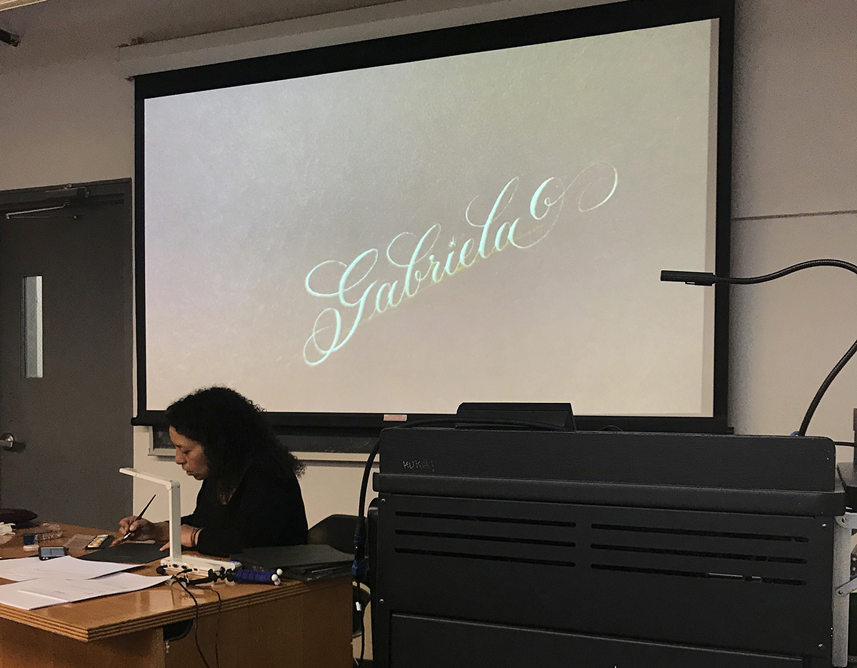
While I was attending graduate school at Rhode Island School of Design, I tried multiple times to fit Richard Lipton’s calligraphy workshop into my schedule but never succeeded. It wasn’t until 2018 that I finally got to dip my toe in ink, when Society of Scribes (SoS) generously offered me the Alice scholarship, named after its founding member and celebrated calligrapher Alice Koeth. The scholarship allowed me to enroll in any of their classes and even get the course materials from John Neal Bookseller, all free of charge.
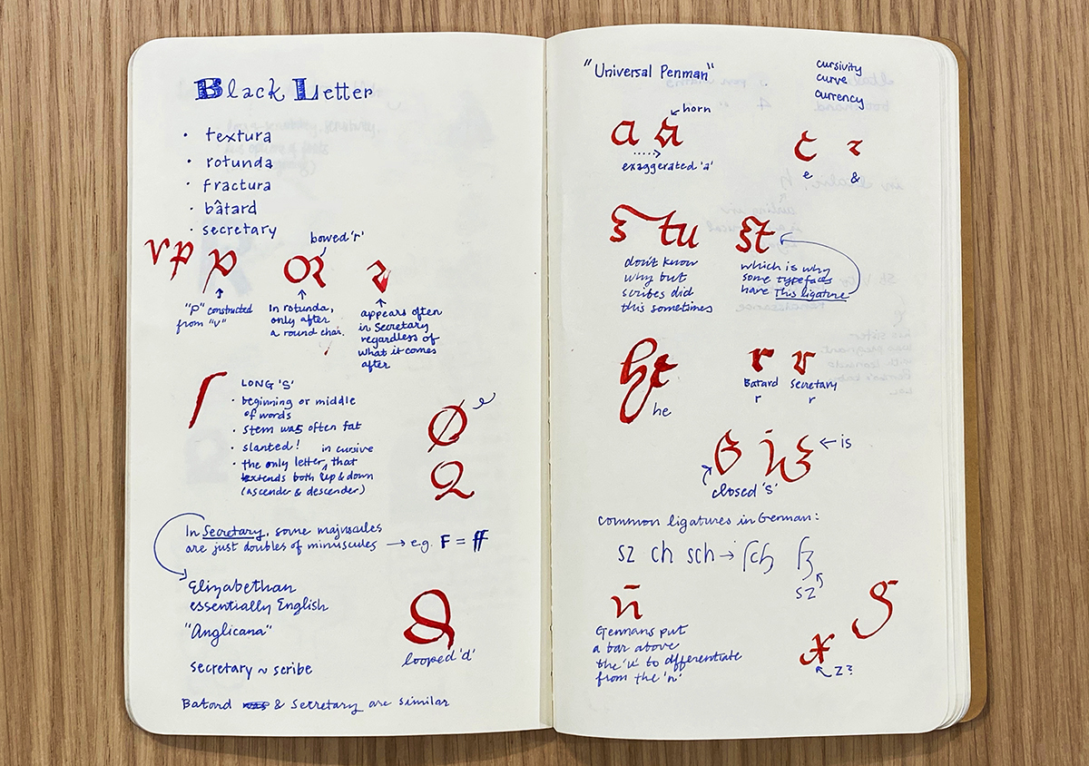
Over the course of the year, I took Retro Deco with Gemma Black, Secretary Hand with Paul Shaw, Foundational Hand with Eleanor Winters, Copperplate with Laura Di Piazza, and Italic Hand with Anna Pinto, and I learned a wide range of things. I now know that Mitchell’s nibs are good for someone with a light hand (not me!) because they’re more flexible, while Brause’s and Speedball’s nibs are sturdier. I also know that in Secretary Hand, some majuscules are simply doubles of minuscules. (i.e. “ff” is the majuscule of the “f.”) In the end, though, what I gained through trying calligraphy went far beyond tips on nib choosing and mini lessons in type history.
Perhaps the most obvious benefit of calligraphy for a type designer comes from the close ties type design shares with calligraphy. Many typefaces we see today have their origin in handwritten letterforms and exhibit calligraphic influences in varying degrees. Understanding where certain forms and tendencies come from can lay a good foundation, even a blueprint, for a type designer who draws type entirely digitally and has had limited exposure to penmanship. It is a bit like the pro-rules argument in typography education: you have to learn the rules before you can break them with intention and impact. You have to know the earlier forms of writing before you can add your own spin. Otherwise, you risk spinning cluelessly.
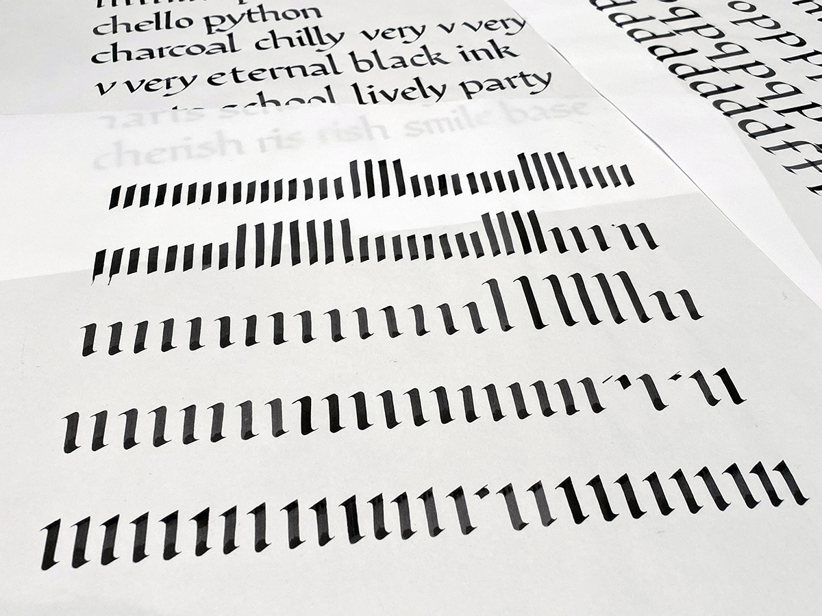
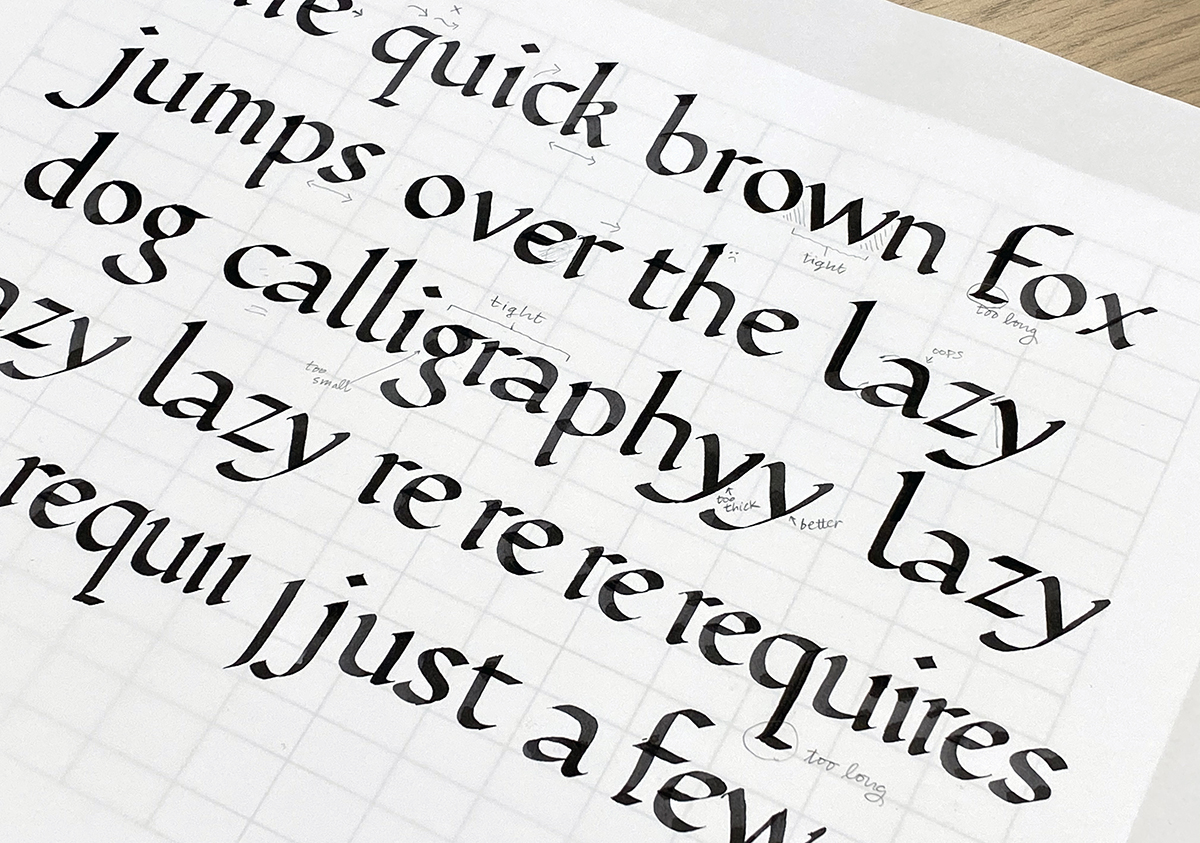
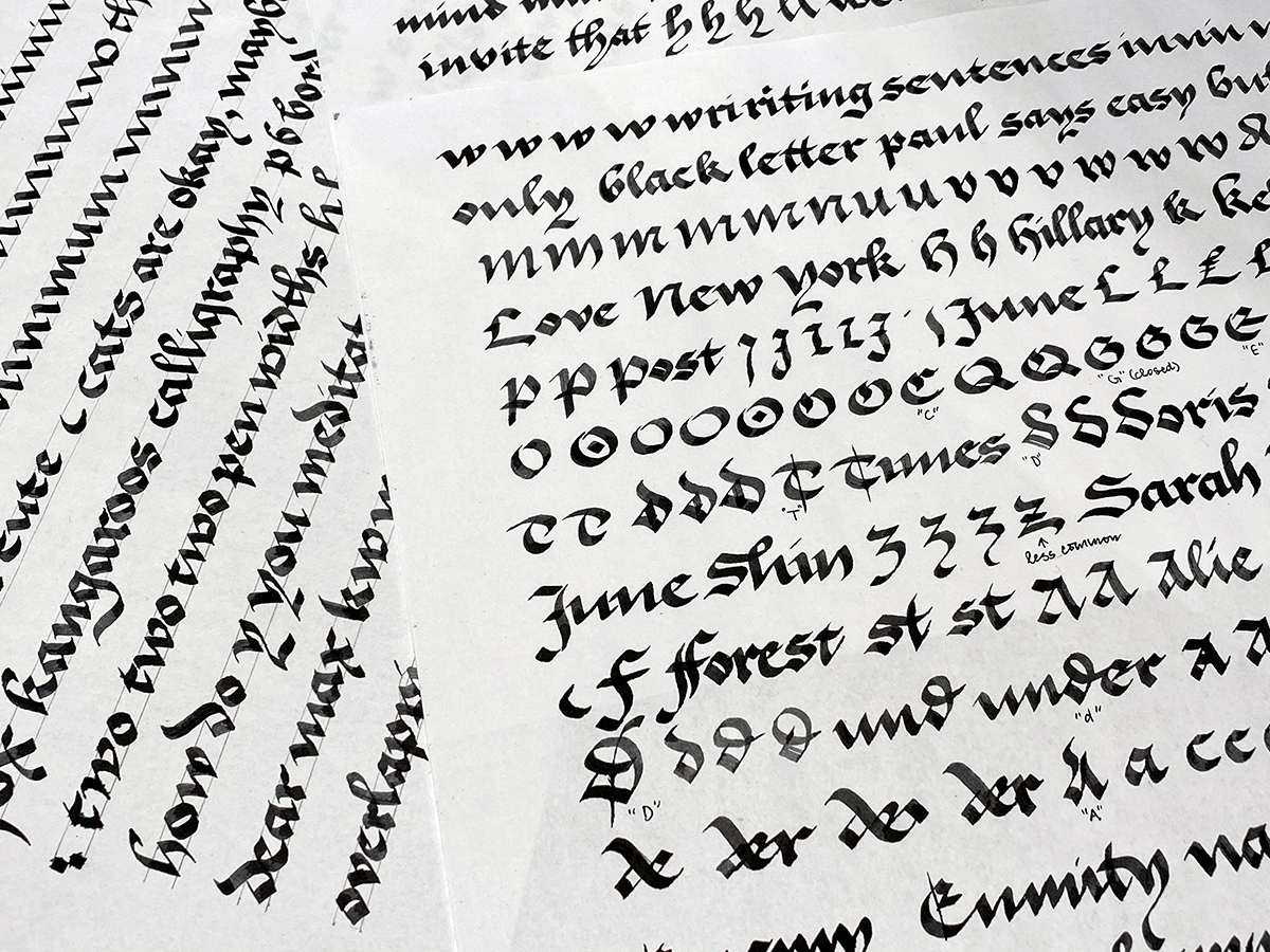
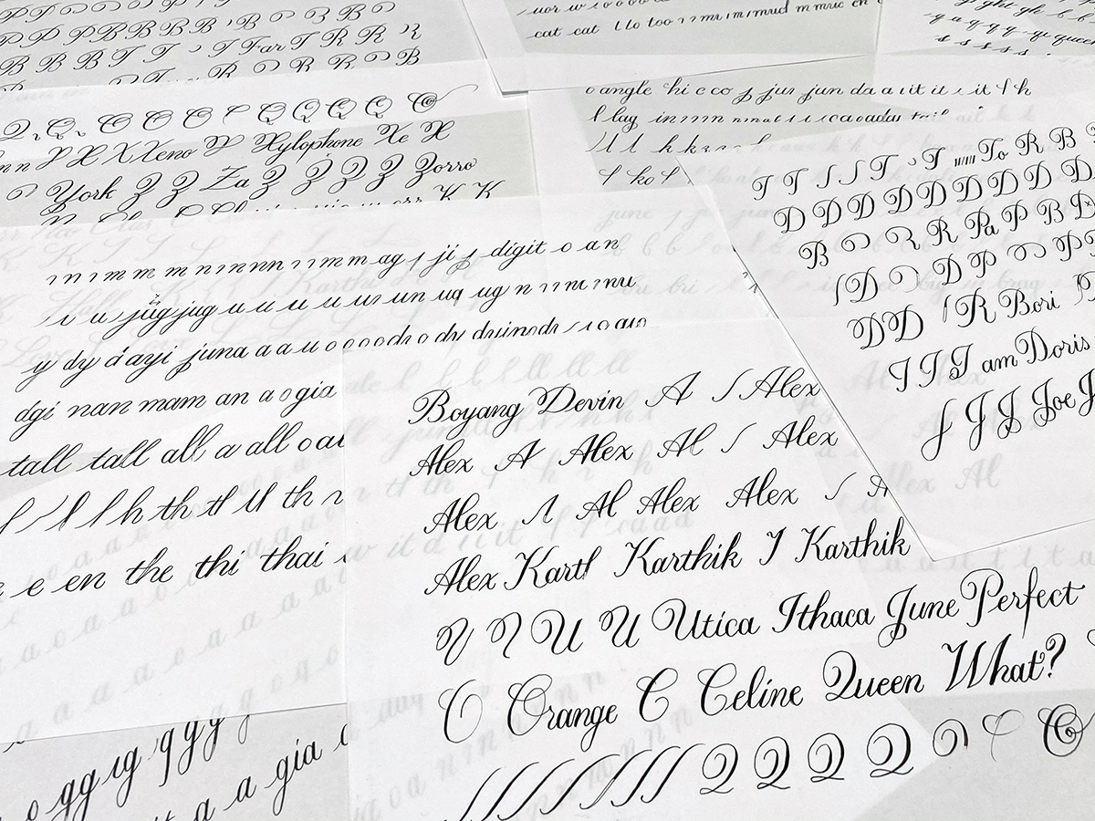
I came to see that in both type design and calligraphy, having a sharp eye is critical. I would complete a practice sheet, put my pen down, and mark it up, making notes on what to do differently next time, like the proofing process in type design. In this sense, being a type designer was helpful in the calligraphy classroom. I was quick to spot flaws when my inky letters were too narrow, too wide, too loose, too tight, too slanted, too upright, too round, or too squarish. Unfortunately, the ability to locate room for improvement did not automatically lead to a problem solved. Even if my brain knew what to do, my hand wasn’t on the same page. Motor skills are gained slowly through repetition.
Even my teachers, who have decades of experience, write their letters differently every time. These variations do not take away from the work, however. They make it more special, more human. I realized that the thing about perfection is not that it’s unachievable—and hence there’s no point in chasing it—but rather that it’s permeable in its definition. “Perfect” can mean different things depending on the subject matter and context. A piece of calligraphic work with quirks, even mistakes, unique to the hand that made it is not any less perfect than a typeface with consistently smooth curves and programmed variations like stylistic and contextual alternates. The perfectness of the former lies in the evidence of the human hand and satisfying material tactility. Calligraphy is beautiful because it’s done by hand.
We live in an age where machines have largely replaced our hands. Our fingers are most accustomed to click and scroll, or double-tap if you’d like. I confess there were moments during these calligraphy sessions when I wished I could just push that imaginary node over a few units or add a bit more slant to a stroke to make it the 45° angle specified for Italic Hand. Or undo just that last stroke. More than once, I caught myself stupidly performing the “zoom in” pinch motion half an inch above the paper, as if I were working on my iPad. It terrified me. Who was I becoming? But I was relieved to know I hadn’t completely lost touch with the physical world. I was sitting in a calligraphy class on a Saturday afternoon, after all.
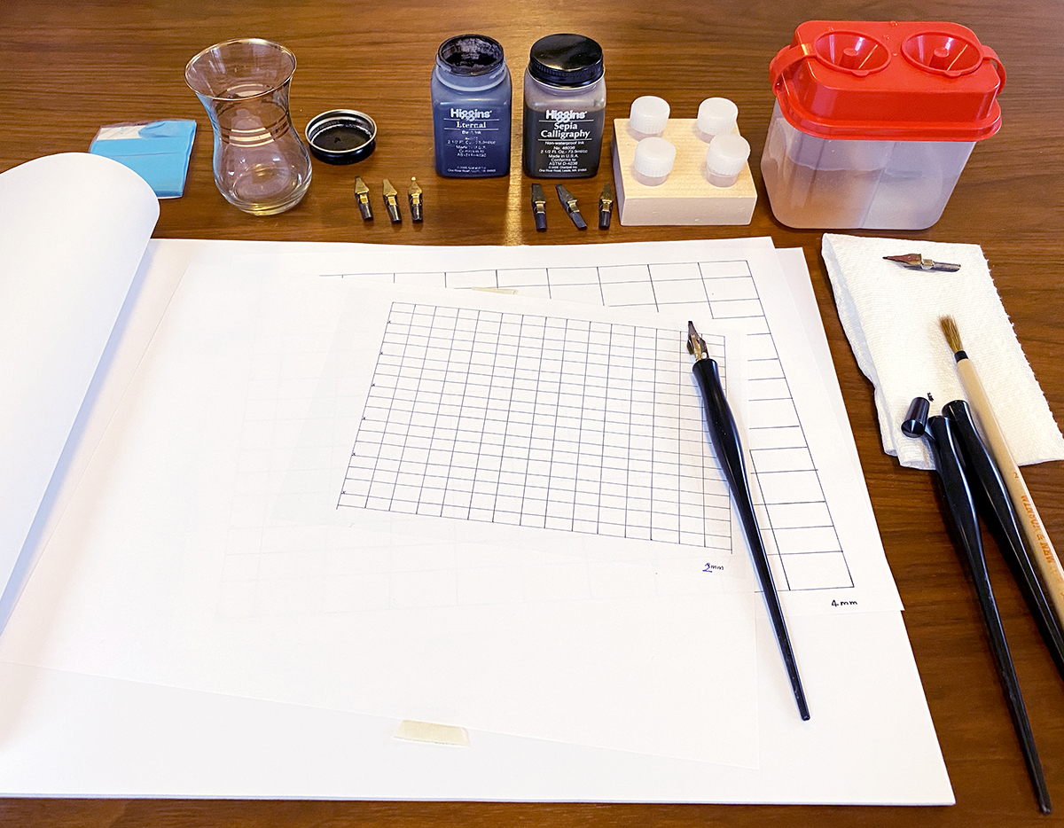
In calligraphy, getting ready—filling the water jug, getting some paper towels or rags, choosing a nib, putting the reservoir on, pushing the nib into the holder, selecting an ink, pouring it into an inkwell, preparing the guidelines and placing it underneath the paper, adjusting the table height and angle—and cleaning up afterward—making sure the nibs are thoroughly cleaned and dried and putting everything away where they belong for the next time—are all part of the practice. I’ve come to appreciate the amount of care that goes into every stage of the process. It turns the whole experience into a meditative ceremony where there is no quick command Z. In this space, everything is slower and a lot messier than in the digital environment. But if you’re like me and spend most of your day in front of a screen, you just might find such an “inconvenience” delightful, if not necessary.
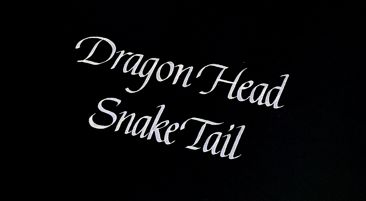
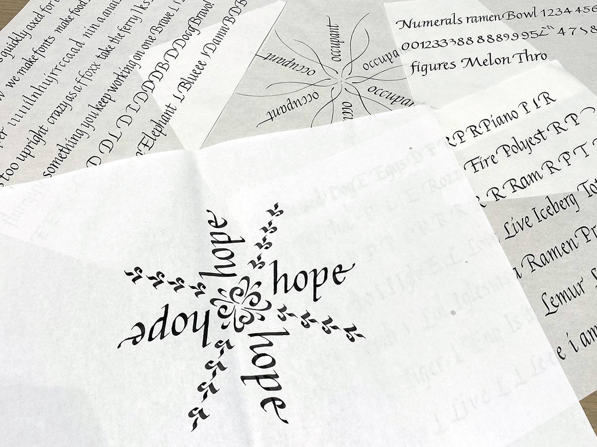
Growing up in Korea, I often heard the expression 용두사미 (龍頭蛇尾), which translates to “dragon head, snake tail.” It’s used for something that starts out strong but ends in an unimpressive fizzle (no offense to snakes). When my Italic Hand instructor Anna Pinto said, “hold onto that last stroke, don’t give it up, control it till the end,” this expression was what had come to my mind. And as we near the end of the year, I hope we can all carry that last stroke with the same commitment with which we began it.
Thank You
Society of Scribes for the scholarship, Richard Lipton for his recommendation, all the instructors for their knowledge and expertise, Cyrus for his encouragement and understanding, Morisawa for the train tickets, and Sarah Mohammadi for accommodations in NYC.