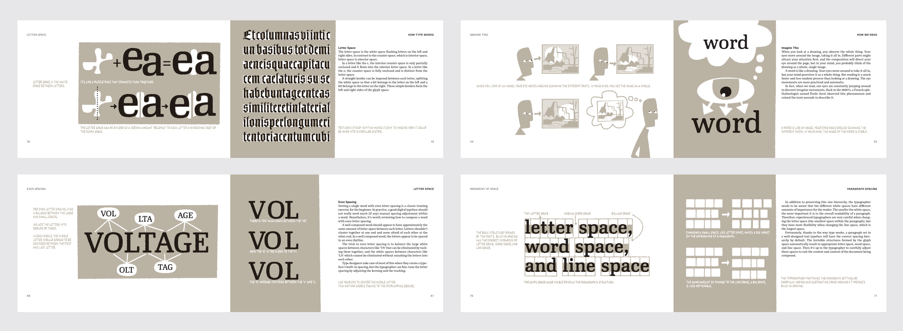
Inside Paragraphs, from Cyrus Highsmith, is about what goes on inside a paragraph of printed text. The goal is to help students train their eyes to see text as typographers do.
It begins with general explanations of how type works and how we read. Then the author steps through the different kinds of space within a paragraph. Finally, it puts everything together with a discussion about paragraph settings.
Typography began with paragraphs of printed text. Since then, it has evolved in all sorts of directions, sometimes leaving ink and paper behind entirely. But the printed paragraph is still a good starting point. Understanding what goes on inside provides a solid foundation on which to build.
And that’s what this book is meant to be—a foundation. Inside Paragraphs is the book Highsmith always wanted when he was a student in his first typography course.
The book was published in cooperation with Font Bureau. It’s available from at the Katherine Small Gallery or via Amazon.
Here’s what people are saying:
“Cyrus Highsmith takes the lid off a paragraph of type and shows its inner workings. There is nothing you need to understand about using type that’s not in this book. Cyrus explains the correct terms for the typographic components of form and space that make a letter, a word, a line, a paragraph, and he does it with clear drawings, simple language, and a legible typeface for the text.” —Matthew Carter
“There is no jargon, no didactic attitude. Reading Inside Paragraphs is like having a conversation with a mentor rather than listening to a teacher lecture. It is the tone and visual look of the book that, as much as its contents, will surely endear it to typography students as much as it will to typography teachers.” —Paul Shaw, June 5, 2012, imprint on printmag.com
“Funny thing is, no matter how much you think you know about type, this rudimentary handbook teaches you there’s more to learn about the most common settings.” —Steven Heller, July 27, 2012, printmag.com
“Inside Paragraphs should be required reading for everyone who studies typography and graphic design. It will also be of interest to anyone else wondering why typography matters. It costs about three Venti Iced Peppermint White Chocolate Mochas ($15). Buy it.” —Ilovetypography.com, Aug 5, 2012
“As a teacher in graphic design I would recommend my students to read this book much more than any other book on type choice or rules, because it teaches how to look to the text and how to ask oneself the good questions in place of just saying rules. By teaching how to look at type this book doesn’t just advise how to set a paragraph but provides a way to educate oneself look and to use it for all aspects of graphic design.” —Jérémy Landes-Nones, July 2012, typofonderie.com