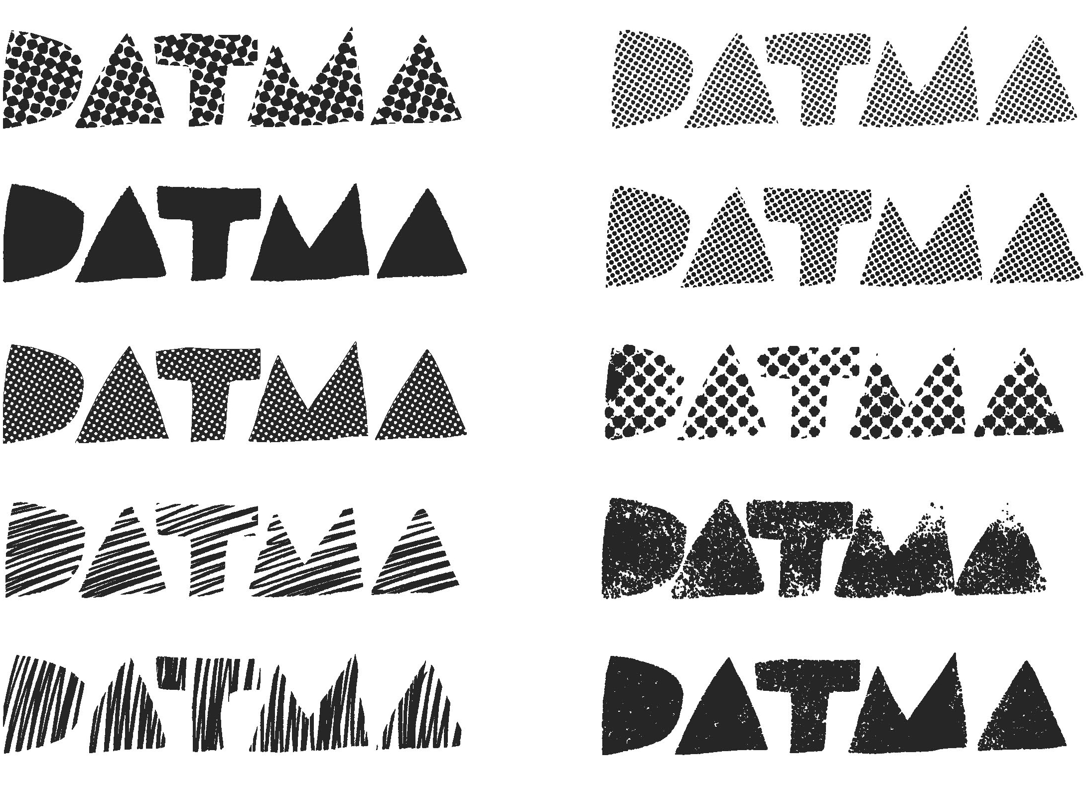
Small and mid-size non-profits generally work within tight budgets and put most of their money towards programming. Beyond adopting a simple logo, larger branding efforts aren’t always on their radar. But clear brand positioning is essential for non-profits to be visible. And that’s where Jane Androski and Emily Rye of Design Agency come in. Based in Pawtucket, RI, they design identity systems and brand strategy for non-profit organizations in the arts, culture, and education. So when Design Art Technology Massachusetts (DATMA) contacted Cyrus Highsmith to design a logo for their newly formed organization, he suggested they bring Androski and Rye onboard too.


DATMA’s mission is making high-caliber art and design available to the public, so they needed an identity that would read as sophisticated, but still speak to as wide an audience as possible. As artists and educators, the board was interested in an aesthetic that would reference process, texture, and the sensibility of the hand-made mark. The challenge for Design Agency was to translate these qualities into a visual language that belonged to the art world, but also felt distinct and “a bit renegade.” Torn-paper, welcoming, accessible, and fun were keywords that anchored their design decisions.

Design Agency used Allium to complement Highsmith’s wordmark for DATMA. As a humanist sans, Allium has the right kind of warmth and personable detail, with an openness that matches the organization’s ethos. Androski and Rye find that some sans-serifs are too cold for their clients. Allium is “a little lighter and a little more approachable.” And as a recent release, Allium was an opportunity for the organization to speak in a fresh voice. For DATMA, the qualities of their logotype are also “fundamental to who they are.” That’s why, Androski notes, “design is such a great process. It is strategy. It’s not just surface design.”

Once DATMA committed to the logotype design, Design Agency began building out the rest of the identity system. They paired Allium with Quiosco, which lends gravity as a serif but feels related in its characterful details. Each typographic voice plays a role—Allium works well for web copy, and Quiosco for printed matter. Androski and Rye created a red and blue color palette, and worked with Highsmith to design a series of textures and patterns, along with rules about when and how these elements could be used together.

Design Agency was conscious of DATMA’s positioning and knew that the identity system needed to accommodate multiple modes of address. They designed the core collateral (stationery, business cards) for DATMA in black and white to establish an institutional voice that fits in with the general visual language of high-end art institutions. Color is used for more public address — bright palettes are put into play for campaigns like DATMA’s upcoming Summer Winds exhibition, and for social media posts and merch like buttons, tees, and totes.
According to Rye, their most common client-education moments are around typography. “If you can’t get the typography right, it really doesn’t matter what your logo is,” says Rye. Investing in fonts is something Design Agency encourages to establish a distinctive voice. A generic sans-serif “isn’t going to share anything about your brand or what you’re trying to communicate.”

Design Agency has worked with a few other Occupant Fonts releases, and Rye used a preview version of Gasket for the Providence Art Design Film Festival poster, program, and count-down animation. Ultimately, says Androski, “We want our clients to be successful. We spend a lot of time talking about design decisions to be sure they feel right from a brand perspective.” Every decision is “an opportunity for the brand to coalesce. And the identity is that much stronger when we make those decisions together with our clients.”
Like all Occupant Fonts releases, Quiosco, Allium, and Gasket is available for print, web, applications, and ePub licensing on Type Network. Webfonts may be tested free for thirty days.