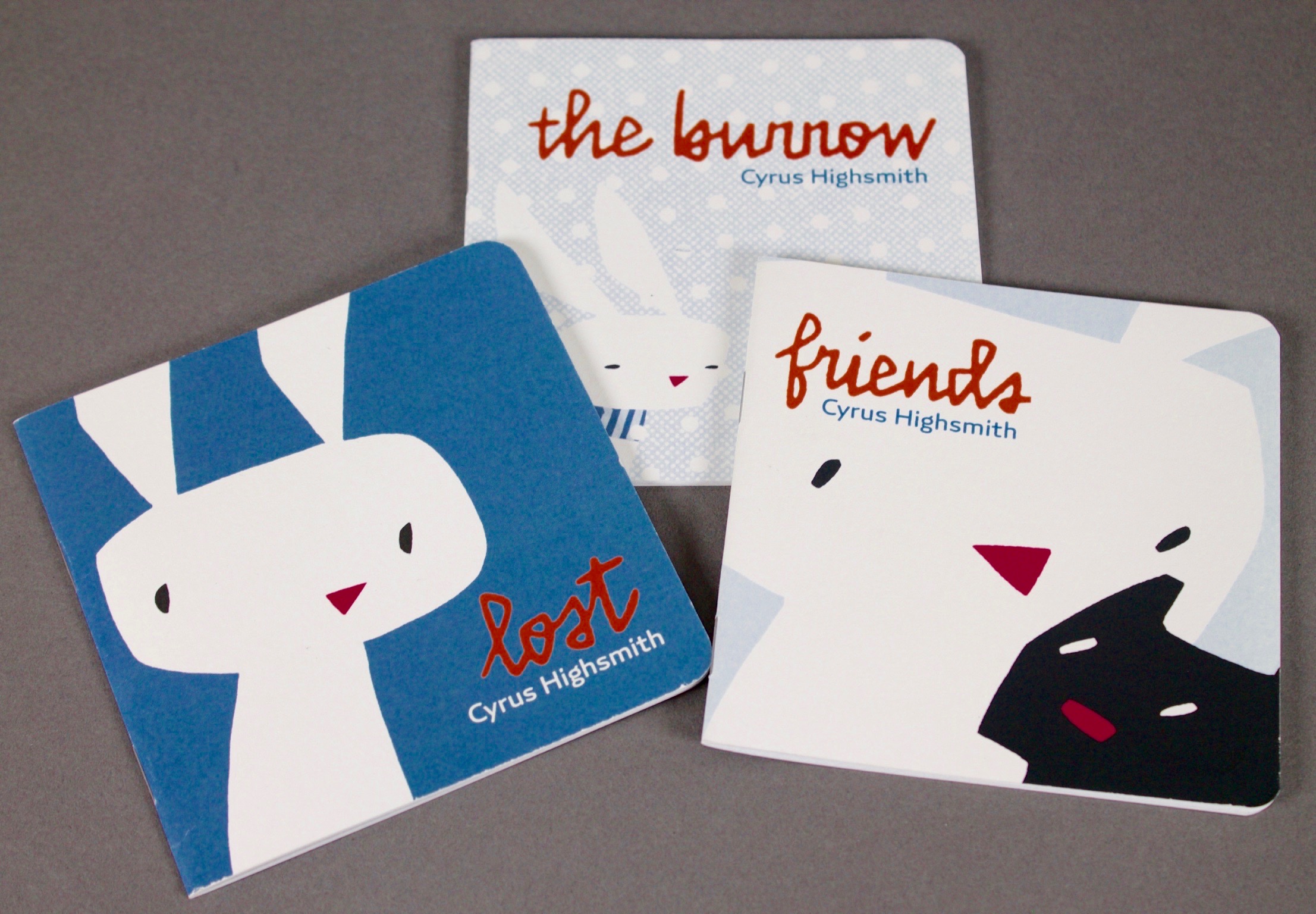
I drew Gasket for The Little Bunny Trilogy, an illustrated children’s book series I made with my young daughter. Instead of just focusing on the type, I was involved in all aspects of the project from the writing and the drawings to the design and manufacture of the books themselves.
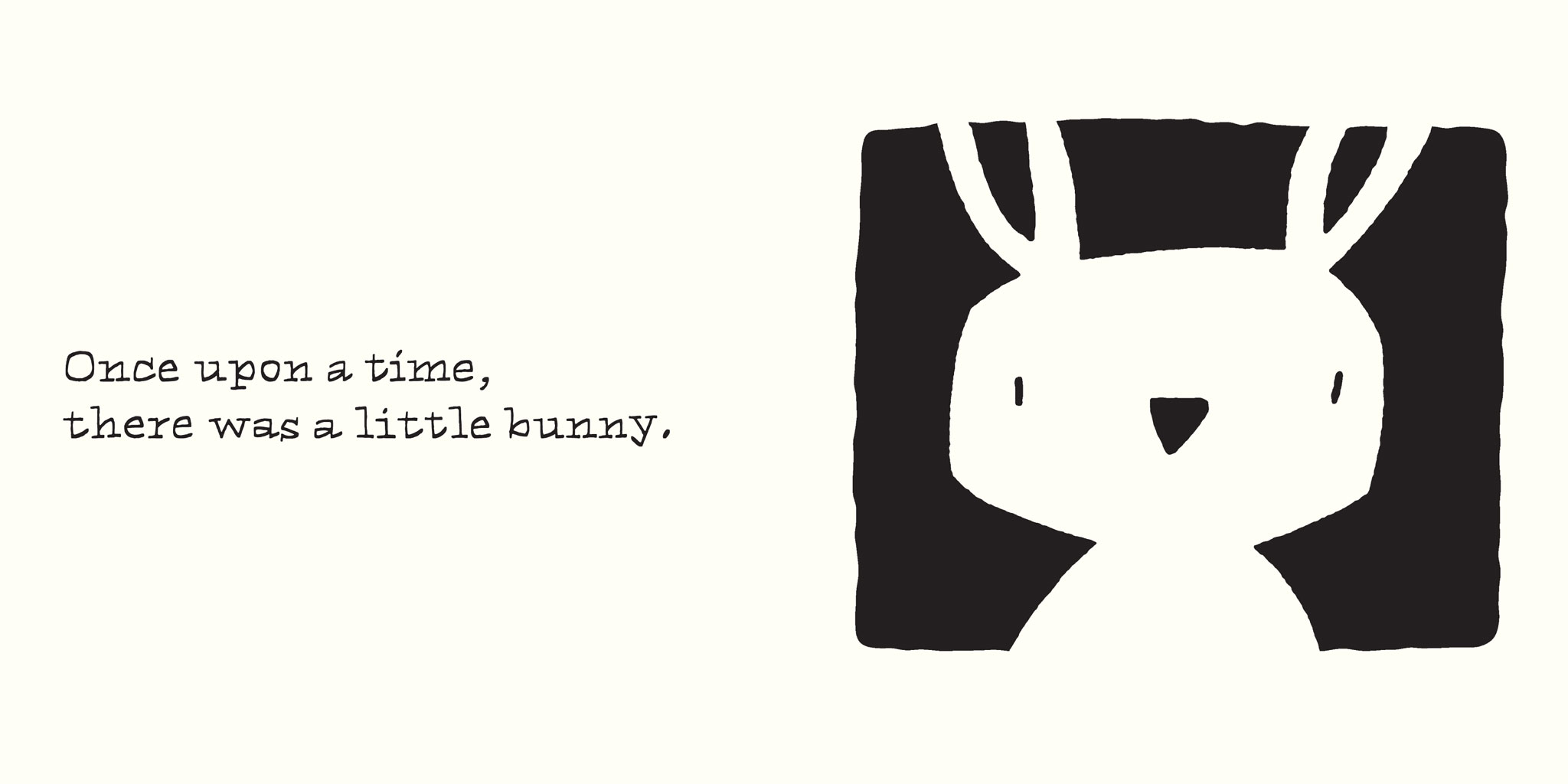
Book one of the trilogy is called Lost. The plot, as developed by me and my then three-year-old, follows a little bunny that gets lost in the forest and meets a monster. The monster turns out to be friendly and the bunny is saved. It’s a very short story.
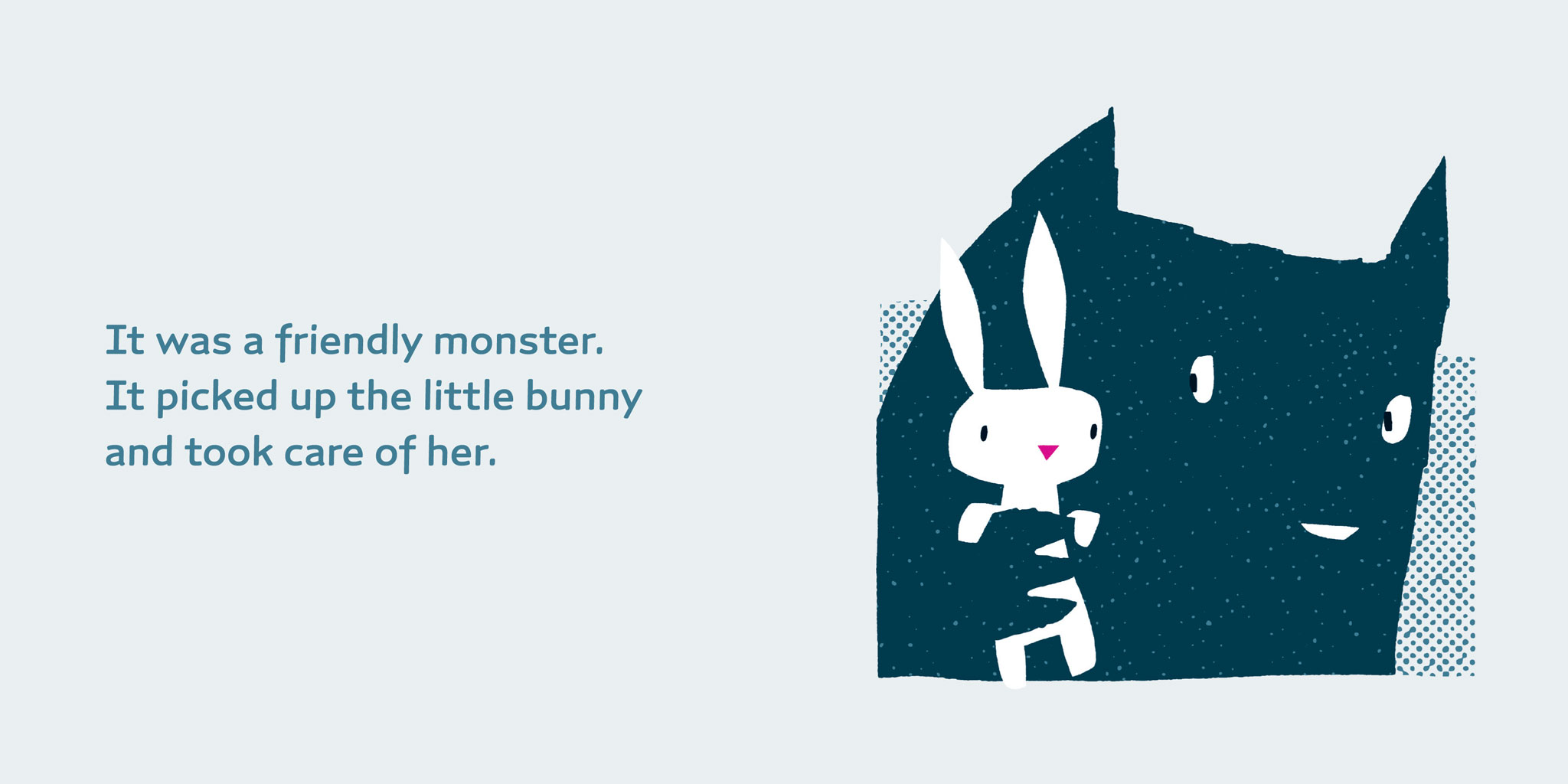
The first draft of Lost was hand-lettered. Lettering seemed like a natural choice. It looked cute and friendly, just like the little bunny. I thought it suited the content and went well with my illustrations.
However, I noticed that my daughter and other small children related to the book differently than adults did. For them, Lost was a serious story. The book’s themes, getting lost and meeting monsters, are existential concerns for a very young audience. The cute lettering had the wrong tone of voice.
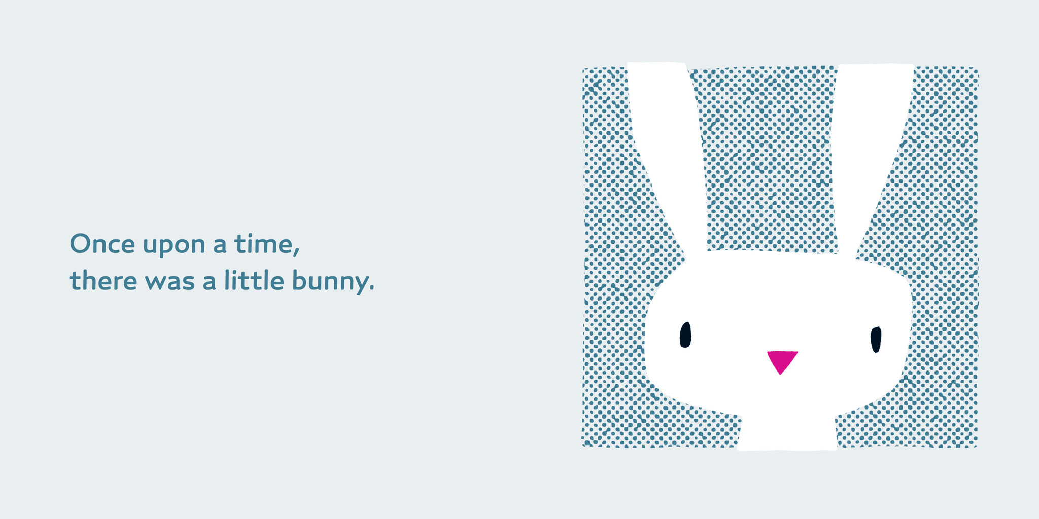
Next I tried setting the text in some of my existing typefaces, but none of them were quite right either. Ibis, a serif design, added a more serious tone but it was too grown-up. Scout and Antenna, both sans serifs, were too mechanical and clashed with the simple, hand-made character of the drawings. So I gave myself an assignment: draw a new typeface, designed for a children’s book, that’s not childish. That’s how Gasket got its start.

Gasket is made of simple, open forms, but I didn’t want it to be too stiff or geometric. I experimented with softening it by using different stroke angles and staggered endings. The effect of these tweaks is subtle but it creates a gentle horizontal momentum. I think it helps pull the reader’s eye across the page.
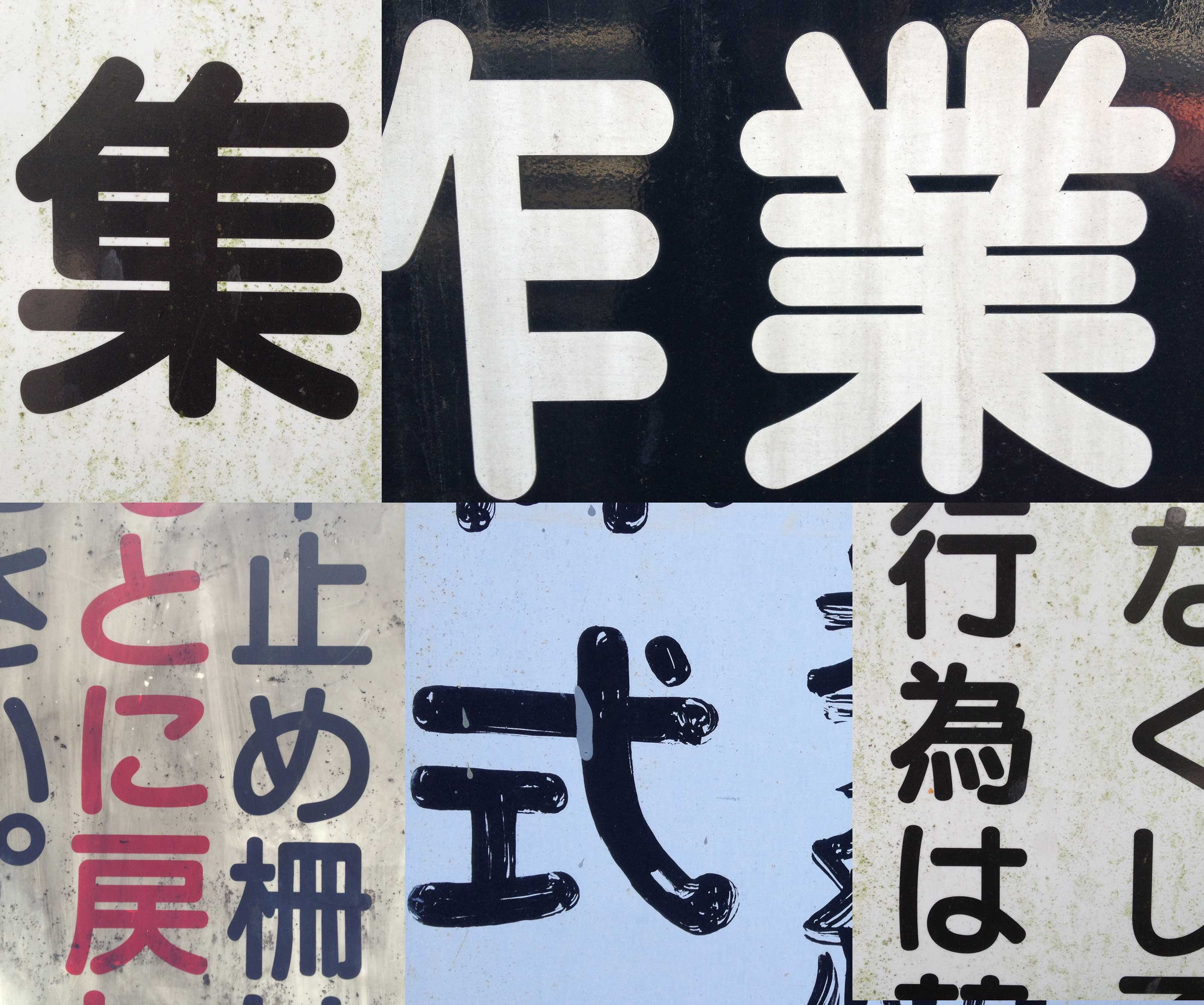
I like to joke that the rounded endings and soft corners make it a child-safe design. In fact, these features were inspired by letterforms seen on my recent trips to Japan. The rounded sans serif style is everywhere in Japanese signage, and it inevitably seeped into my brain. Now it has leaked into Gasket, a typeface for a book about a little lost bunny.
A small edition of the Little Bunny Trilogy was published by Occupant Press and sold at a pop-up shop in Tokyo, bringing Gasket back to the place that helped inspire it.
Projects like this are critical to my creative practice. The different sides of my work, type design and illustration, feed each other. When I draw a new typeface for a specific project, and I can really focus on that context, it helps me avoid clichés. It pushes me to make something that hasn’t been done before. And when I’m the art director too, I have the flexibility to experiment with unlikely ideas and inspiration.
Like all Occupant Fonts releases, Gasket is available for print, web, applications, and ePub licensing on Type Network. Webfonts may be tested free for thirty days.