I’ve always wanted to live in New York: after moving to the United States from Japan over two decades ago, landing in a suburb of Boston, I remember taking day trips on the Chinatown buses just to spend hours walking through the city. I’ve now lived in various neighborhoods of New York since 2011, and despite the compromises of living in such a densely populated area, I still feel attracted to its power.
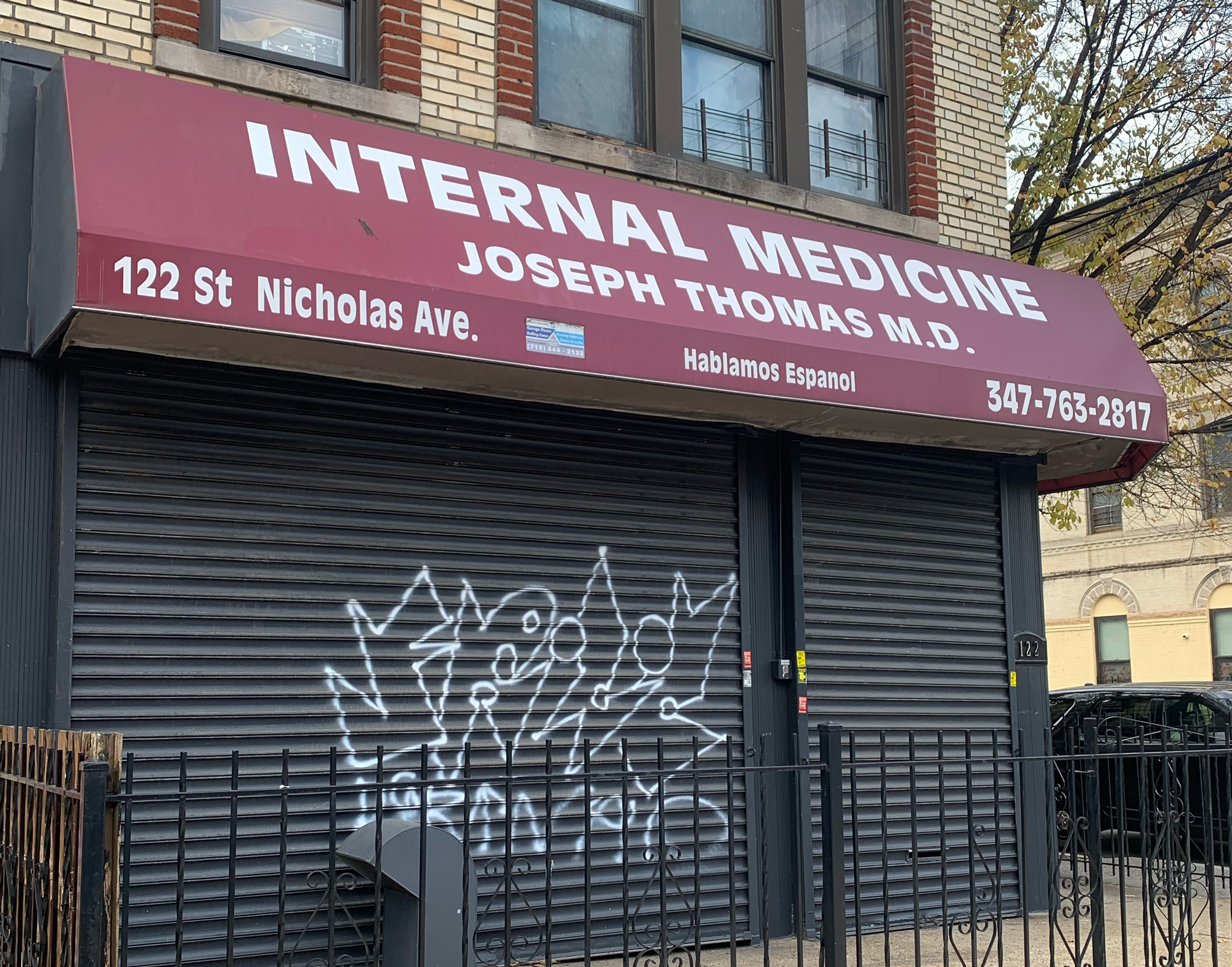
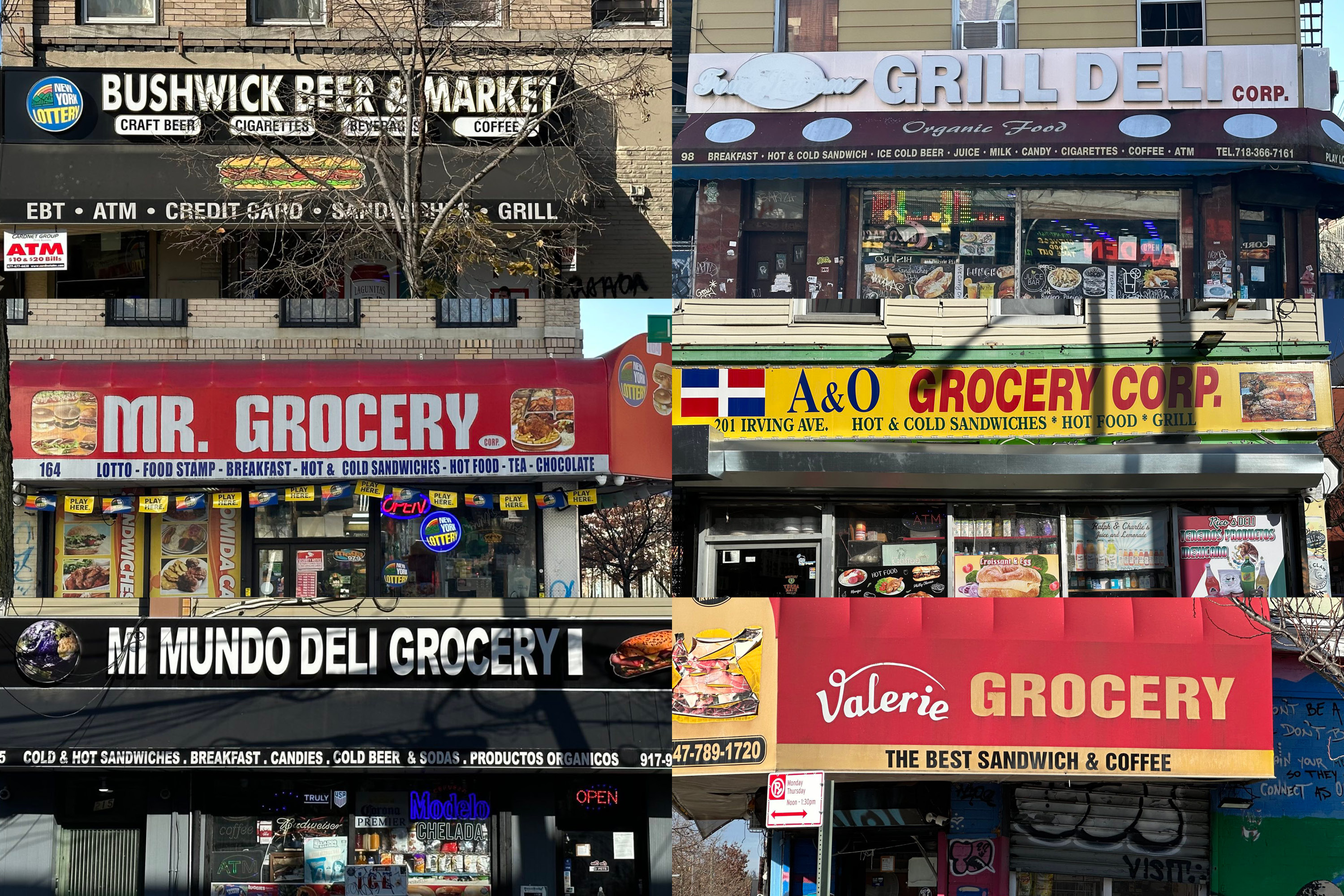
For me, part of that energy comes from the fact there is always so much reading that happens automatically in New York. Here, like in other urban environments, words constantly appear before you. Pale yellow-blue letters may have soaked in the sunlight for decades; other words may be freshly sharpied on menu scraps to communicate unexpected disappointments (i.e. temporarily closed.) Unlike in a suburb, a single walk down the block will force you to read a million things: a constant stream of storefront signage, discount announcements, construction signs, cones of flyers wedged between gates—whether in plastic or vinyl or spray-paint, living in the city means being enmeshed in a barrage of language.

It’s usually the kind of thoughtless reading that blurs into a collection of visual noise; you can only see GROCERY so many times without not noticing it anymore. We become immune to these “advertisements.” But they also represent a sincere effort to communicate with the public—and an effort to make a living. Today, in an environment where more and more words on the screen are written not by humans but by robots, these hand-selected, sometimes hand-written signage almost feel like endangered species. In an age of multimodal-algorithm-driven marketing, there is something quaint about words that have committed to their specific physical location. And each instance of DELI GROCERY is different—there is no sign that is exactly the same, often typeset to the available space: condensed, wide, bold, or painted in script. And each represents a different story: the cashier’s greeting, the flavor of its egg-and-cheese breakfast sandwich, maybe its cat’s personality.
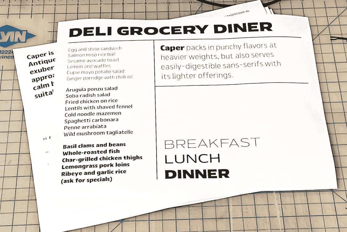
The kind of hum that results from this vibration of words is what has continued to fuel my interest in living in New York, and also became a starting point for crafting my typeface Carp. You can read more about the typeface in the design notes.

Carp’s origins come full circle in the promotional microsite, created in collaboration with designer Gabriel Melcher. In discussing how to capture content that ranges from expressive display to rigorous body text, we landed back in our local neighborhood: Gabe and I live within a 20-minute walk of each other—and the microsite became about reading the city contained in between our apartments.
Moving east–west on the site, the visitor can walk through the two parallel commercial streets that connect us, dense with storefronts and language. Scrolling vertically in the more residential blocks between those streets allows the visitor to explore text about reading itself and exploring a city. Store names set to randomized points of the font’s design space, along with excerpts of texts by various authors and artists, provide an eclectic typographic anthology of city living.
Gabe described the site concept as inspired from looking at his piles of books:
The minisite is a walk down a street.
The street is a bookshelf.
The books are the buildings.
One of the foundational keywords was the Japanese term tsundoku, a play on the words to “stack” and to “read.” It points to the common phenomenon of having piles of books that have not yet been read—an object of piled intention rather than of comprehension. (A Bookman’s Glossary from the early 1900s describes it as one of the three “methods” of reading: verbal reading, silent reading, and stacked reading.)
Living in New York can feel the same way: there is an overwhelming amount of potential activities in which we hope to participate. We are suspended between the constant pull of what the city has to offer and an equally powerful impossibility to do it all—powered by an undercurrent of almost unfounded optimism, an infinite intention to engage—if not now, sometime in the future.
I write this as I am in fact, about to bid farewell to the city. But its piles of language would remain stacked in my memory—and the hope is still there, to someday open all those storefront spines and read through all the stories new york city has to offer.
Like all Occupant Fonts releases, Carp is available for print, web, applications, and ePub licensing on Type Network. Webfonts may be tested free for thirty days.