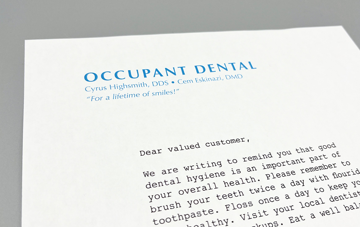
The typefaces of Hermann Zapf dominated the typographic landscape of my childhood in the United States during the 70’s and 80’s. It seemed like at least half of all the printed advertisements I saw were set in Palatino and there must have been a law that mandated all dentist offices in North America use Optima in their letterhead.
As a child, I couldn’t actually identify typefaces, and I’m pretty sure there weren’t actually any regulations like that. However, when I began to study typography in the 90’s and Zapf’s typefaces were part of the curriculum, I recognized them right away, shuddered, and averted my eyes. To me, they represented the voice of musty middlebrow American graphic design. That’s what me and my fellow art students desperately wanted to move away from.
Later, during my training as type designer, I kept hearing from older and much more experienced colleagues about how much they admired Zapf’s work. I listened in disbelief and tried to keep quiet. The overexposure to his typefaces in my formative years made this point of view difficult for me to understand. I decided to try to force myself to look at his designs again with a more open mind.
This was in the early 2000’s. I started by diving into Optima. As a young type designer, Optima’s unusual classification as a calligraphic (or modulated) sans serif, appealed to my sensibilities. It was a lucky starting point—since then I have read that it was Zapf’s personal favorite among all his designs. It’s probably a coincidence but I was also getting a lot of work done on my teeth around the same time. Note to my younger self: don’t forget to floss!
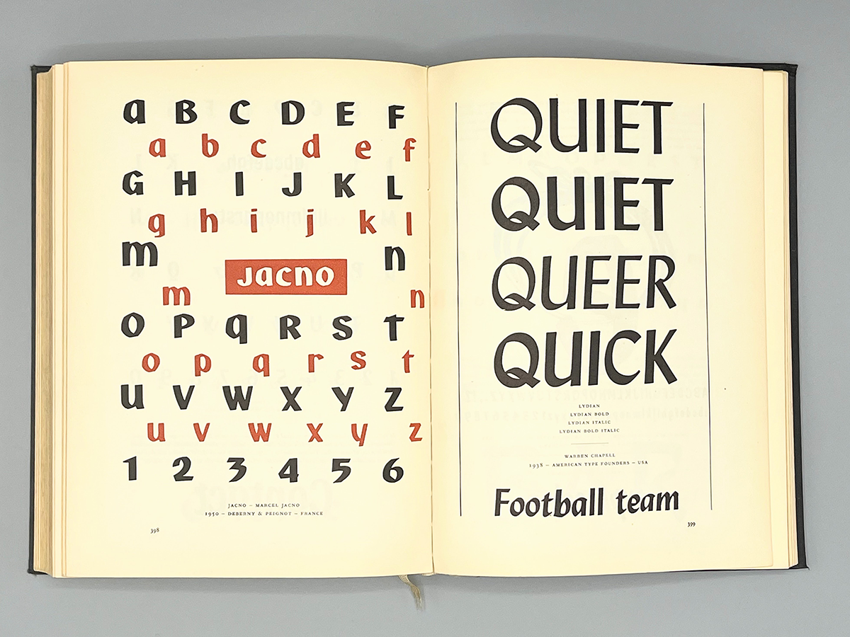
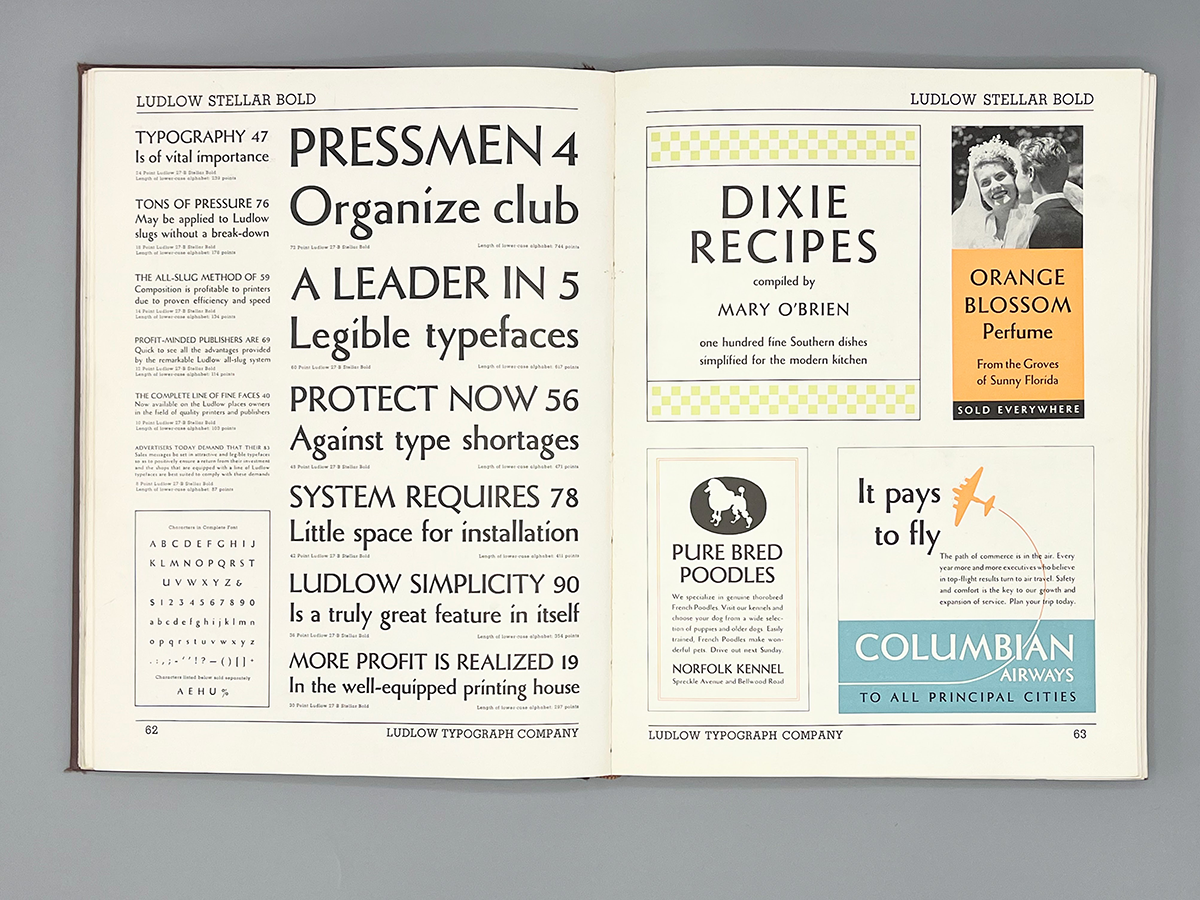
I studied specimens of Optima. I read about it in books like Alexander Lawson’s Anatomy of a Typeface. I examined its predecessors like the very calligraphic design, Lydian by Warren Chappell, and an even earlier modulated sans series from Robert H. Middleton called Stellar.
This research was helpful but it was secondary to what was going on in my sketchbooks and on my laptop. To really understand Optima, I started drawing my own modulated sans. As a shortcut, I began by slicing the serifs off one of my text faces, Prensa.
This is a process I have used to kickstart other designs and one I enjoy very much. It might seem like deriving new designs from previous work would trap me into doing the same things over and over. In fact, I find cheap tricks like this can be liberating. They help me to get into an experimental frame of mind, play around, and find fresh ideas. It doesn’t always lead to success but the stakes are low. In this case, it pushed me down a path that eventually led to Amira.
Since Amira’s initial release, I have learned about other Optima predecessors like Pascal from José Mendoza y Almeida. There are also some other recent typefaces in the same neighborhood like the elegant Utile Display from Kontour, Matthew Carter’s muscular Carter Sans, and the mechanical Condor from DJR. Still, there aren’t many typefaces in this category of sans serifs.
Optima might be the only modulated sans serif that has ever achieved much commercial success and general visibility. Indeed, in economic terms, Amira was not an obvious candidate for an update. Former Occupant, Cem Eskinazi, convinced us to do it and took on the work himself.
In Cem’s own words:
Upon joining Occupant Fonts, I stumbled upon Pentagram’s redesign of the Garden Museum in which Amira was paired with Humanist 970—Bistream’s revival of Adsans. The bouquet was completed with Matisse-like colorful cutout shapes, arranging the organic and the graphic perfectly suited to the institution’s ethos.
What impressed me was Amira’s ability to handle serious heavy lifting when it comes to delivering both complex and long form content while maintaining an expressive and dynamic texture. During my training years at Occupant, I aspired to learn how to think and draw in this manner. At the time, I didn’t realize that designing Quiosco Display had already laid the groundwork for working on Amira as both designs heavily rely on similar exercise of form-counterform choreography.
Several factors motivated me to propose expanding the Amira family. Firstly, it seemed unjust for such a strong design to be confined to a minimal character set. In addition to a comprehensive expanded Latin, Amira deserved a set of numerals with a complete set of tabular, old-style and lining options. Introducing a fresh cut of small capitals would make Amira a workhorse family. Secondly, I wanted to embark on the challenge of crafting a Greek and Cyrillic recognizing the shapes’ potential to shine within these scripts.
My admiration towards Amira placed a good amount of pressure on me as I tried not to “mess stuff up” and respect Cyrus’ original vision in developing the new set. I believe re-visiting the Amira project after 20 years proved to be a fruitful idea. Leveraging contemporary tools and methodologies, we were able to refine the design, ironing out its nuances and rejuvenating its essence.
I’m happy we listened to Cem and hope Amira 2 helps to increase the overall popularity of this under-appreciated genre of typefaces. Plus, there is more Amira to come next year—stay tuned.
I still think of the dentist when I see Optima but I have come to respect Zapf’s work, especially his calligraphy. Check out the short film, The Art of Hermann Zapf, to see him in action. Read about it here.
Like all Occupant Fonts releases, Amira 2 is available for print, web, applications, and ePub licensing on Type Network. Webfonts may be tested free for thirty days.