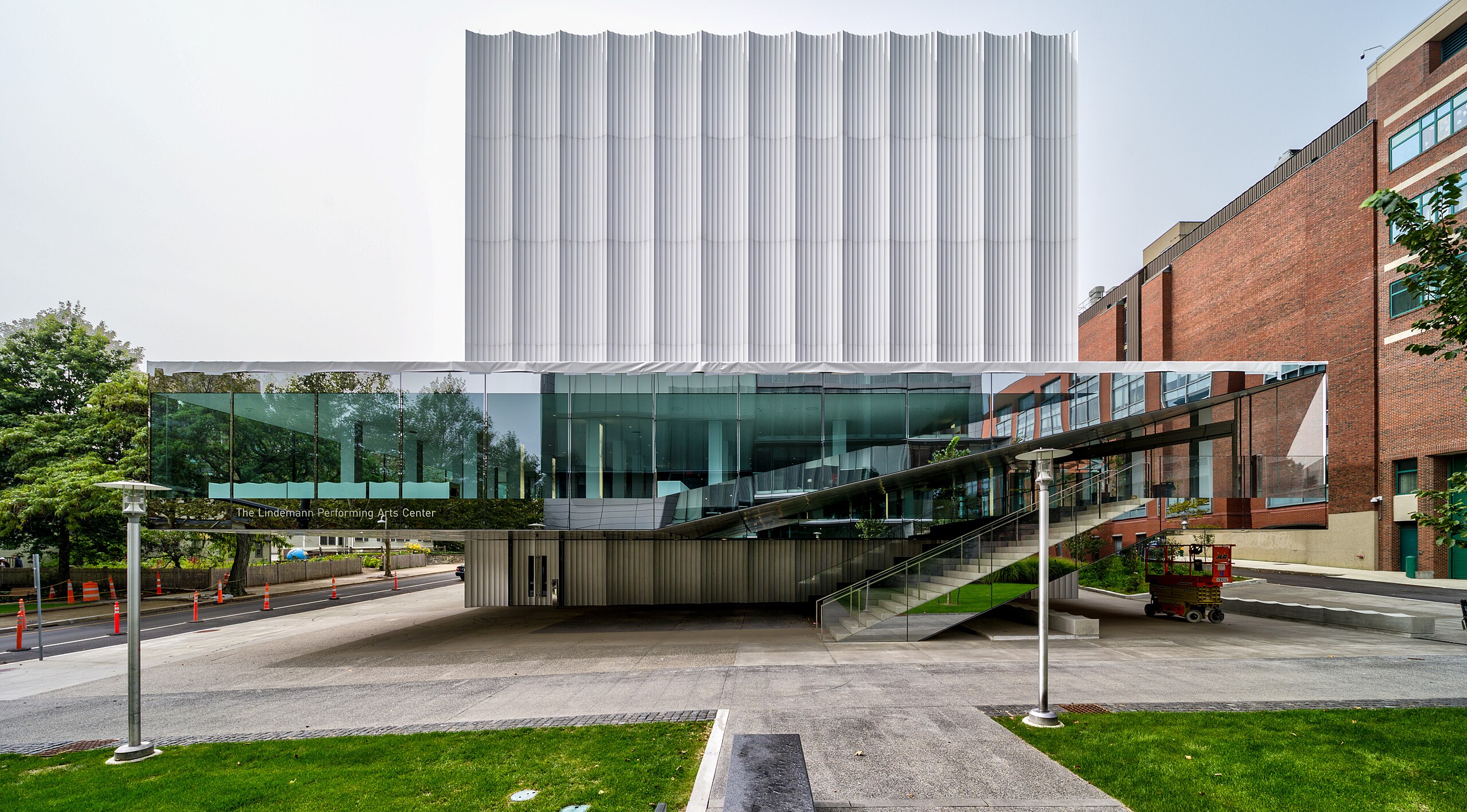
In early 2023, Brown Arts Institute (BAI) was preparing for the fall opening of the new Lindemann Performing Arts Center. As part of these efforts, BAI began the development of a new online arts journal. Seeking designers with local ties, the journal’s editor Shirine Saad approached alums from the Rhode Island School of Design (RISD) Minkyoung Kim and Marie Otsuka to help create this digital platform: a publication that “brings together multidisciplinary artists to respond to urgent questions in society and culture.” As a type designer at Occupant Fonts, Otsuka also recognized the potential for an original typographic voice to capture the publication’s unique identity. The resulting custom font and online publication — Movements — was a result of a dynamic collaboration between BAI, Kim, and Otsuka / Occupant Fonts.
Minkyoung Kim and Marie Otsuka (collectively MK+MO) had already worked together on several web projects, among other collaborations. The two met while teaching at RISD and had originally joined forces to increase code literacy. “After working together on an initiative called Code Lab, created to help designers to expand their concepts in code, we naturally began collaborating on projects outside of school as well,” Otsuka explains. Since then, they have made websites for clients including educational institutions, artists, writers, and fellow designers: ranging from a sonic platform Radio Amnion for artist Jol Thoms to a robust digital publication Who Are We Now for researcher Blaise Agüera y Arcas. “Working with professionals in various disciplines, such as artists, poets, and engineers, can be intellectually stimulating and provide a broader perspective,” Kim says.
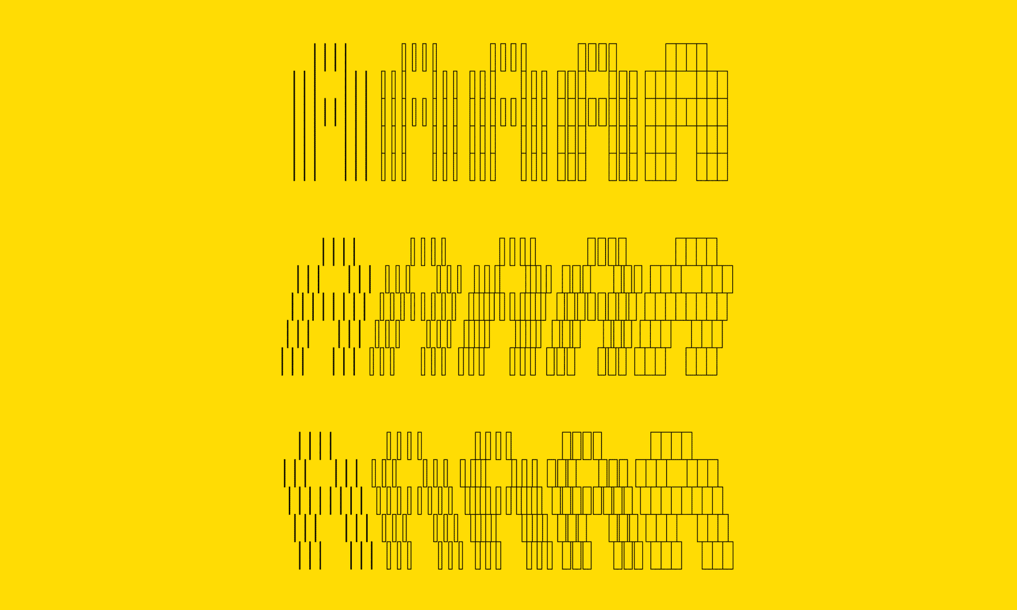
The components of the BAI publication developed concurrently — while Kim prototyped the website, Otsuka developed the custom typeface, providing multiple beta fonts in the process. This allowed each of them to, as Kim puts it, “influence and propel each other’s progress.” Otsuka explains that quick testing within a website context was beneficial, even from the early stages of the font design. “Initially, the proportions of the typeface were more similar to a typical pixel font, with squarer components. Minkyoung’s feedback and experiments helped shape the typeface into more condensed proportions, which lends itself better to headlines and display use.”
What also tied the independent processes together was a foundational design framework centered around performance, inspired from the architecture of BAI’s new arts center. The building’s architects (REX) constructed a reflective exterior and functionally flexible interior; BAI’s digital publication could similarly reflect its environment while providing a flexible medium for writing on the arts. Otsuka notes: “Specifically focusing on performance was interesting, because a website, in a way, is performative, albeit digitally: how can the interactions on the website embody the physical conversations present in performance? Shirine, the editor of the publication, often referred to the site as a ‘stage.’ With the custom font and site behavior, we were hoping to engage the site’s audience in dramatic ways.”
The primary display face is an animating variable font, which mirrors the undulating vertical lines of the building’s aluminum flutes. Instead of skewing the upright roman version, the italics feature staggered components to mirror how the sun cascades off the building’s façade. Otsuka provided live animations early on in the type drawing process, which allowed the more experimental movements of the variable font to thrive, sliding through backslant, upright, and slant styles. The font is featured on the header of the website as well as in the essay titles, and the angle of the slant axis reflects the time of day at the center: becoming fully vertical at noon and midnight local time.
The site design, similarly, features fluid movements activated on hover. Kim describes how, although the final design approach for the overall website changed from earlier mockups, the custom font remained a strong throughline in the design. “Throughout the project, the layout and style underwent significant changes in response to various contexts and feedback. Marie’s consistent type development played a pivotal role for the project’s foundation, enabling flexibility in these layout adjustments and changes while preserving a cohesive voice.”
Movements Arts Journal website launched in October 2023, and you can read the inaugural issue here and read more about the design process of the custom font.