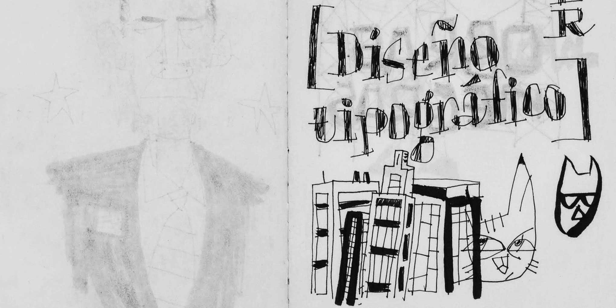
For the last twenty years or so, I’ve been carrying a sketchbook everywhere I go. I draw in it every day. Sometimes a lot, sometimes a little. I don’t have a favorite kind or size of book, although it has to have blank pages, with no lines or dots or grids. I like to experiment with different drawing tools too. The main thing has been to keep moving—draw until the book is full, then start a new one.
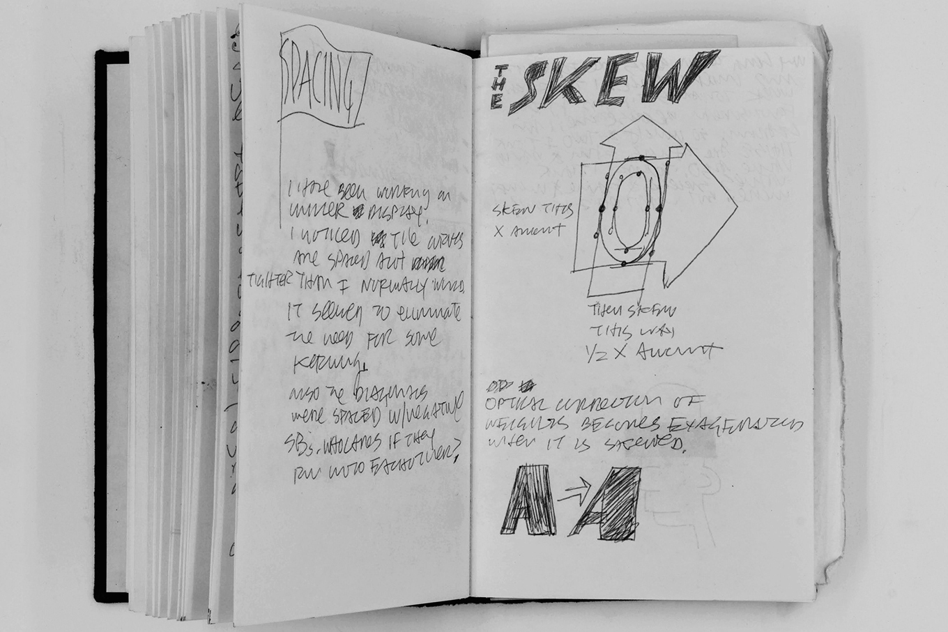
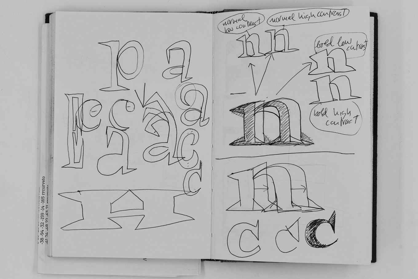
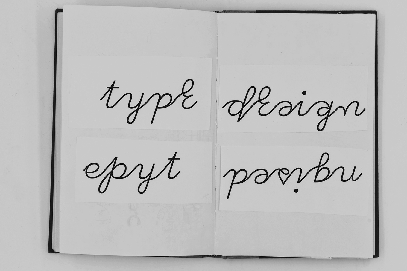
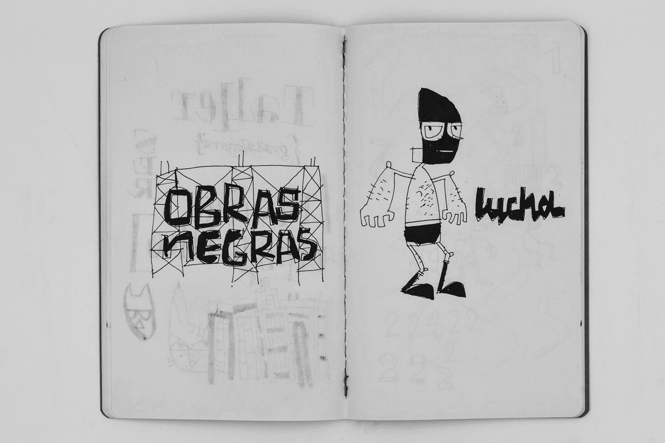
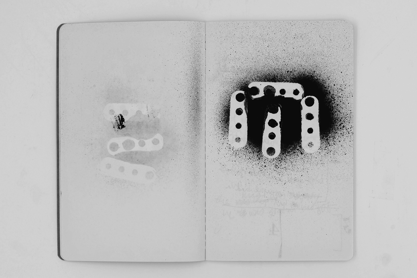
The books from the 1990s and early 2000s are mostly notes about making typefaces. I was at the beginning of my career as a type designer, in the midst of an intense learning process. There are also some drawings, stencils, and collages in these books. I made those late at night in an attempt to quiet my mind. But most of the pages document my struggle to learn as much about designing type as I could, as quickly as possible.
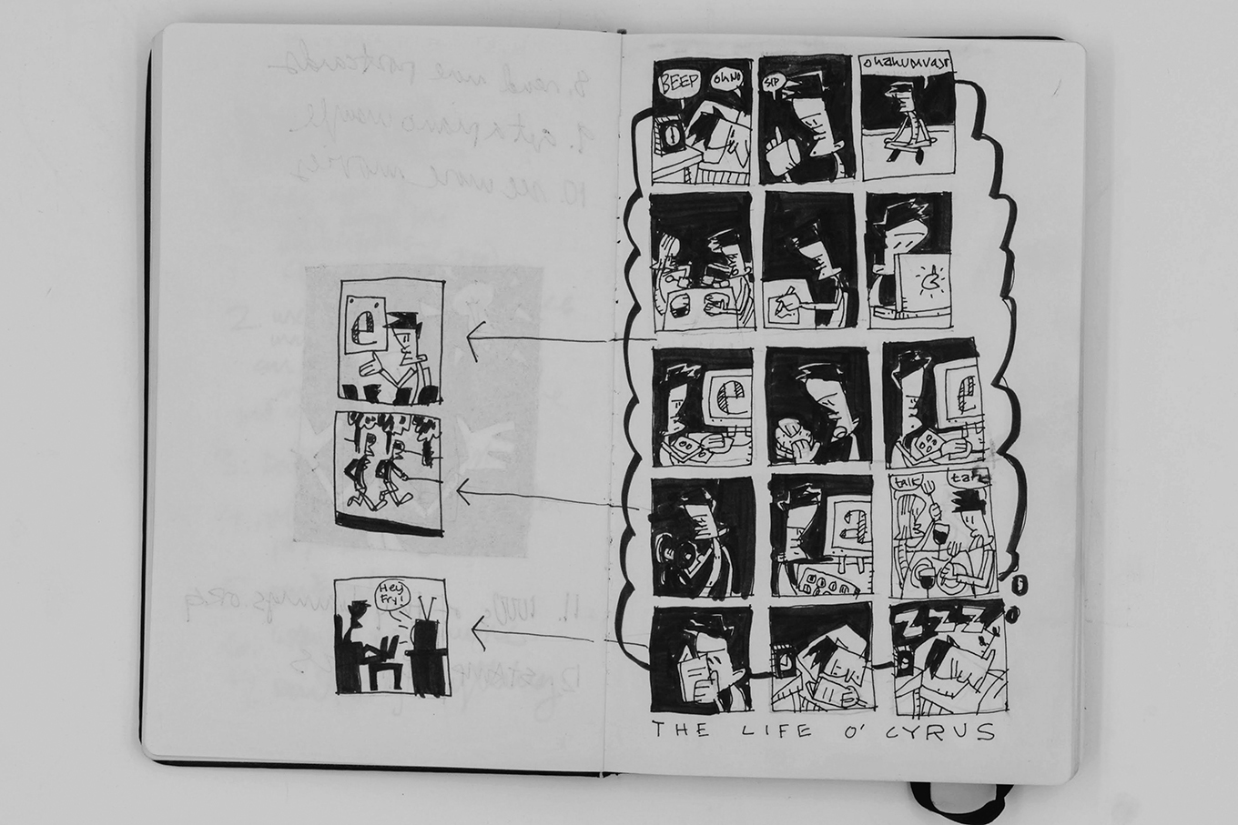
Around 2005, I started drawing a lot of cartoons. I had some years of professional experience behind me as a type designer and felt comfortable letting myself think about other things. I had always liked comic books and I wondered if I could make one. I quickly learned that having expertise in one area doesn’t automatically make you good at others. But I kept drawing.
Around 2011, I began to focus more on drawing from observation. I was spending a lot of time in parks and libraries with my young daughter. While the other parents chatted and looked at their phones, and our children stumbled around and played, I worked in my sketchbook. Trees, chairs, kids, parents, swings—I drew the things in front of me.
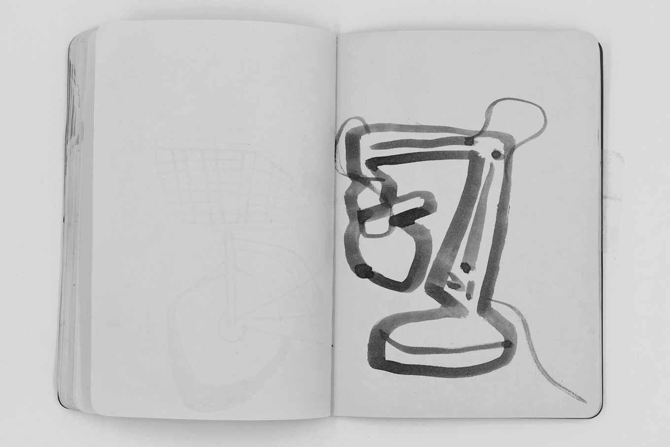
I mostly did contour-drawing exercises. I would draw an object’s silhouette while only sort of looking at the page. Sometimes I didn’t look at all, sometimes I looked a lot. Then I would add the inside shapes and details.
Thanks to this practice, my line became more than just a mark on the page. It became an edge that described the border between the object I was drawing and the area around it. I learned to draw two things at once, the shape and the shape of space.
This shift wasn’t a sudden realization. It’s an awareness that started building long ago. The interesting thing is how it has come to connect all the different kinds of work I make.
I design type, illustrate books, and make prints. I write and teach. My sketchbooks are where all these things get mixed up and ferment. That’s why they are such an essential part of my practice.
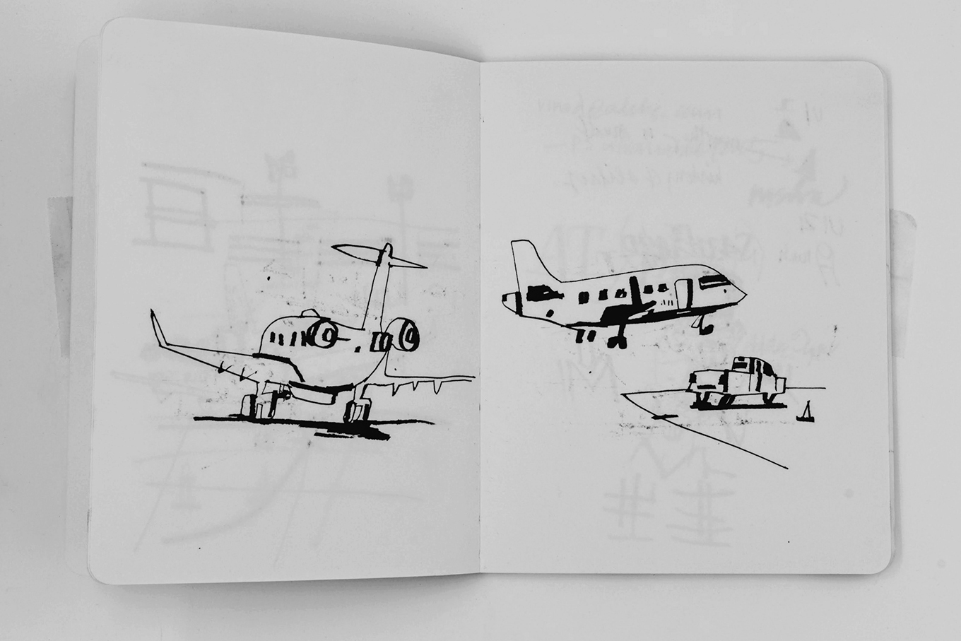
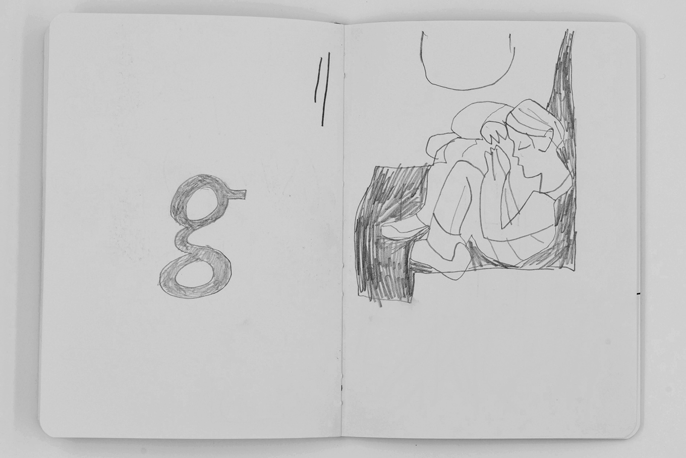
My ultimate goal is to learn to draw the way that I draw. That sounds simple, but I’m still working on it. There are 135 sketchbooks on my shelf. I’m going to keep drawing in number 136 until it’s full. And then I’ll start a new one.
I originally published these reflections in Products of a Thinking Hand, the book that accompanied the Gerrit Noordzij Prize exhibition in The Hague. Only a thousand copies were printed.