One of my favorite parts of type design is something I think of as transformation—the process a design goes through as it becomes different versions of itself. This includes shifting from a roman to an italic, as well as growing from a light into a bold. There can be transformations that happen across width, as a design expands and contracts. But the most fundamental kind of metamorphosis a typeface goes through has to do with size.
With any kind of transformation, the trick is to develop a strategy for how shapes change. The strategy depends on both the design and the kind of transformation. There’s no one-size-fits-all solution.
Matthew Carter described the weight transformation of his Galliard Light into Galliard Ultra as a “caricature.” His strategy was to exaggerate the features of Light more and more as the design got heavier and heavier. As a result, the boldest weights maintain the sparkle of the lighter ones. I’ve used this strategy myself in designs like Prensa.
Caricature isn’t always appropriate, however. Adrian Frutiger’s breakthrough with Univers was the consistency of its design as it transformed across weight and, to a lesser extent, width. While Frutiger’s approach employed some subtle exaggeration in the heavier weights, the overall goal was unity across all of the different versions. I thought about this kind of strategy when I was developing the different weights and widths of series like Scout and Benton Sans.
A well-executed size transformation combines caricature and consistency. Unlike weight and width, though, size transformations aren’t usually meant to catch your eye. In fact, the reader might never notice anything is going on. That’s by design.
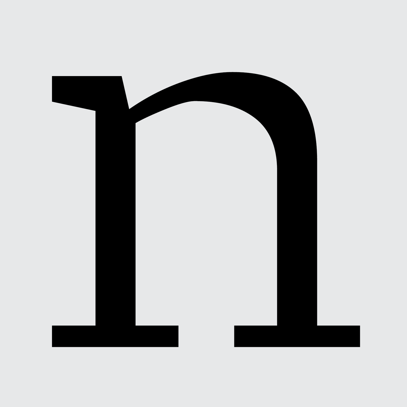
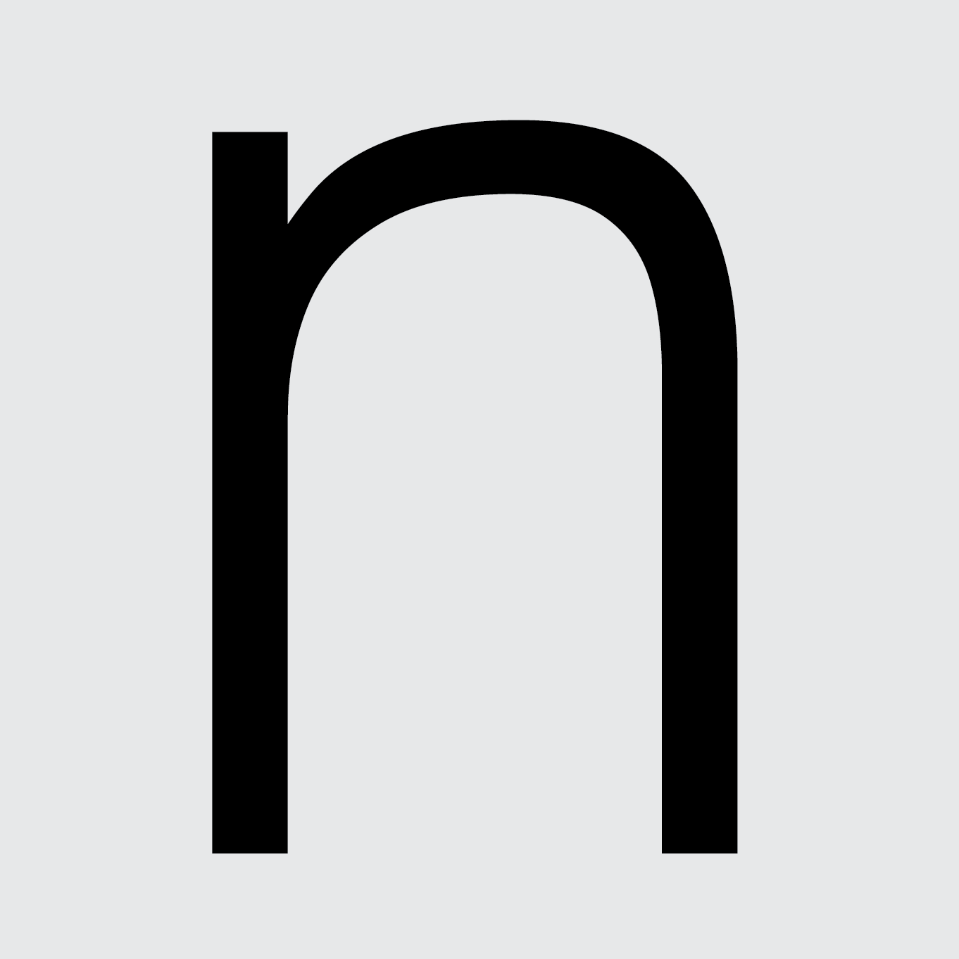
The transformation from Allium, a 24-point master, into Allium Text, an 8-point master, illustrates this balancing act. Most of the differences fit into two broad categories: changes to the shapes and changes to the dimensions.
The careful harmony and balance between the black and white shapes that make the original Allium series hum get in the way at smaller sizes. The seemingly parallel edges of the curves in the headline version are adjusted in the text version so they begin to converge more quickly. This pinching results in interior and exterior shapes that push against each other, making them more visible. It’s an exaggeration of the subtle optical adjustments from the larger sizes.
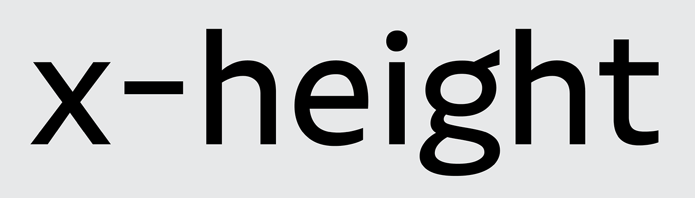
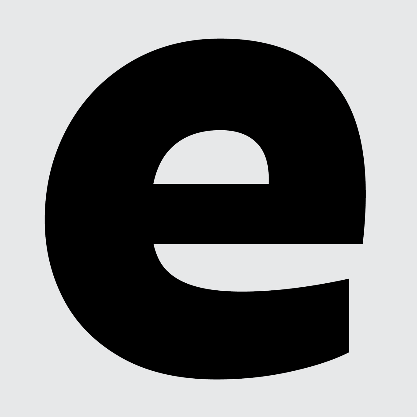
Even with these changes, some letters can still appear cramped at small sizes. That’s why Allium Text has a larger x-height than Allium. It keeps the lowercase from collapsing in on itself. In addition, everything gets a bit wider so the curves, diagonals, and straights have enough room to be themselves. Finally, the space between the letters also increases. Both Allium and Allium Text, when used at their intended point size, should appear to have “normal” tracking—not too tight, not too loose.
As the number of ways type gets used keeps multiplying, transformations are more important than ever. In fact, thinking about the potential ways a letter might change often starts as soon as the type designer starts drawing it. Yet it has been a part of the design process practically since Gutenberg. The more things change, the more they stay the same.
Note: In addition to Allium Text, other designs in our library with optical sizes include Zócalo, Prensa, Quiosco, Ibis, and Scout.