The design of Quiosco is a manifestation of Cyrus’ way of seeing and constructing letters. He makes alphabets through focusing on the interplay of black and white shapes rather than following traces of a mark-making tool. Quiosco gets its personality from the tension between the interior white shapes and exterior black shapes. Cyrus calls this shape contrast. Strong shape contrast helps a design retain its character at small sizes and in poor printing conditions. However, at larger sizes, this feature can appear cartoonish.
The challenge of designing Quiosco Display was figuring out how to adapt it for editorial use in headlines while preserving its original flavor. In order to achieve these, I played with uppercase proportions, rethought the italics, and introduced sharper features.

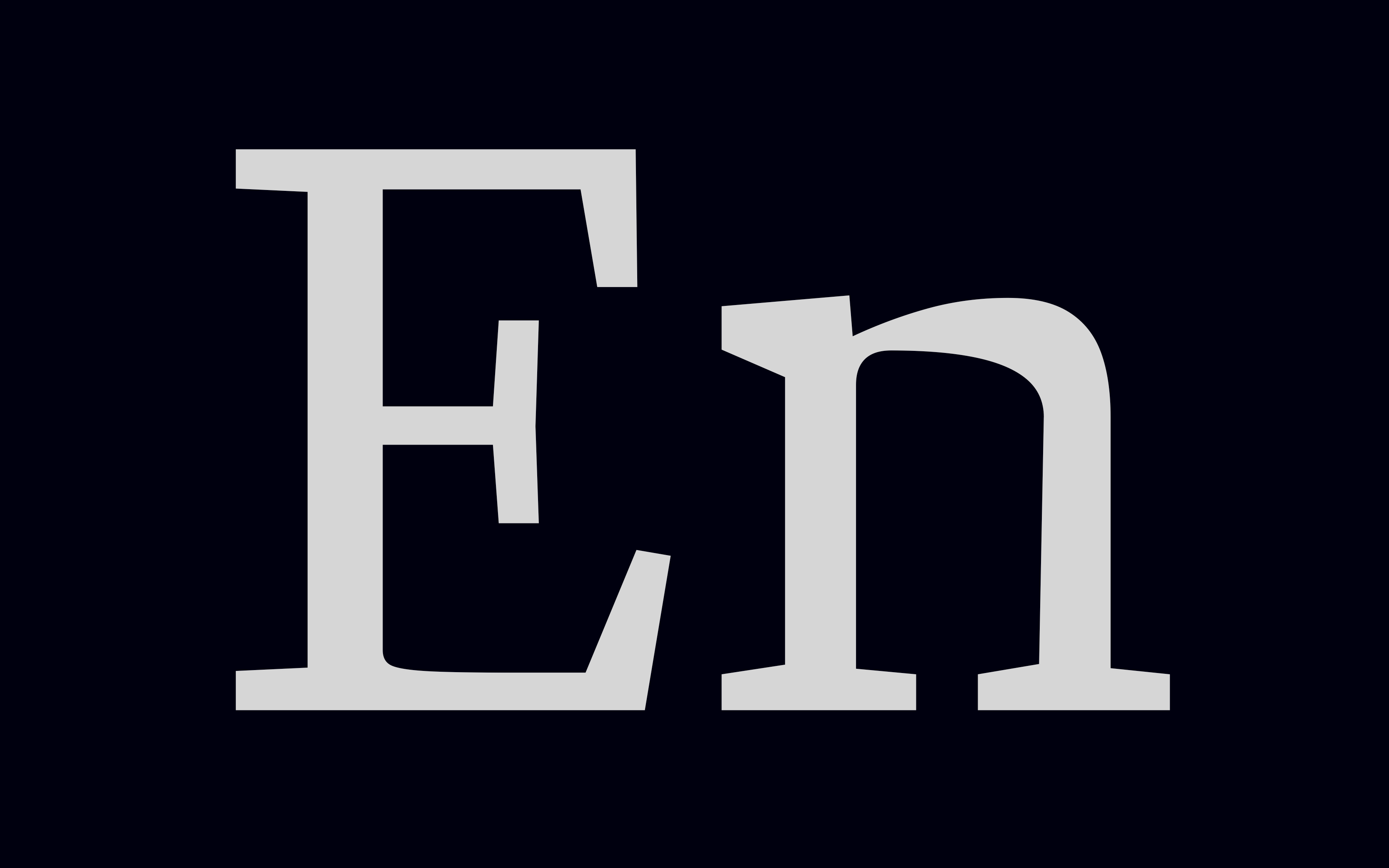
Quiosco Text has regular proportions and a steady tempo. For the display cut, I decided to let uppercase letters have varying widths, following the proportional standards laid out on Trajan’s Column. This adds traditional flavor to words set in all capitals. In addition, the tempo becomes more organic and less mechanical.

If you prefer regular widths in all capital settings, try using the small capitals. I added small capital figures so no one will ever know!

The italics are by far my favorite portion of this family, especially the diagonal characters like v, w, and y. Since this is a display cut, I wasn’t shy about exaggerating the characteristics Cyrus laid out in the text version.

The italics were too playful for what I was going for in the display version. My approach was to substitute the round calligraphic incoming strokes with a sharp serif. This made it more compatible with the voice of the display cut and, as a side effect, improved the fit.


Quiosco, to me, felt like it is sculpted out of wet clay. While testing the text version, I typed the word “Play-Doh” on the editor window. It was then that I decided to run this experiment: can I translate the material feel of the type? If the text version is soft and organic, can the display version feel hard and mechanical, almost like stone? The results of this fun experiment manifest itself in many shapes and forms hidden inside the parts of letters of Quiosco Display. Among many examples, the easiest ones to observe this transformation are the legs and tail of the uppercase R, K and Q. The cuts on the outside of these shapes are a new feature aimed to bring back the spirit and feel of letters carved on a slab.
The process of designing Quiosco Display was fun and interesting both for me and Cyrus. On my end, I had to solve a puzzle to understand and reverse-engineer the formal ideas that define the DNA of Quiosco. As for Cyrus, he got to sit back and watch his design evolve and transform. It was a new way of working for both of us, and we are happy that it worked out great in the end.

Like all Occupant Fonts releases, Quiosco Display is available for print, web, applications, and ePub licensing on Type Network. Webfonts may be tested free for thirty days.